Short answer
Art direction is the work of defining and guiding a project’s visual expression: which images, colors, typography, materials and compositions communicate its idea. An art director makes those choices coherent and helps other makers carry them through. On a small project, you can set an art direction by translating the brief into specific visual decisions, testing them and recording what should stay consistent.
What is art direction?
Art direction connects an idea to what people see. It is not simply choosing attractive images or making every asset use the same color. It asks why a particular image, type treatment or arrangement belongs to this project, and how that choice works beside the rest. A coherent direction gives photographers, illustrators and designers room to make original work without guessing the intended visual character.
The U.S. Bureau of Labor Statistics’ Art Directors profile describes responsibility for visual style and images in publications, packaging and movie and television productions. It also describes directing others who develop artwork and layouts. That distinction matters: art direction includes decisions and guidance, not just personally producing every final image.
For a personal project, you may perform both the direction and the making. Separate the two moments anyway. First decide what the work needs to communicate; then make a proposal and review it against that intention. This gives you a better question than “Do I like it?” when an appealing image pulls the project away from its purpose.
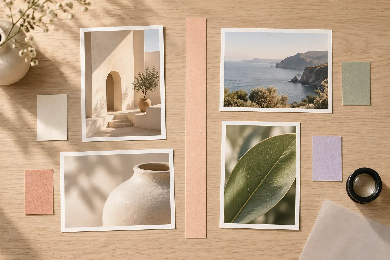
A mood board can show the intended visual character, but the board is a tool, not the entire job. Art direction also requires explaining choices, testing applications and making decisions when references or requirements conflict.
How art direction changes across different fields
The broad idea travels across disciplines, but job titles and decision boundaries do not map perfectly from one industry to another. Ask who owns the overall concept, who approves visual decisions and who manages implementation. The practical examples below show kinds of visual decisions, not a universal staffing chart.
- Advertising
- Guide how the message appears through image choice, composition, typography and the relationship between visuals and copy. Check the direction across the campaign’s actual formats.
- Editorial and publishing
- Guide covers, image selection, page layouts and visual hierarchy so the publication has a coherent character while different stories remain distinct.
- Film and television
- Work within the art department to realize a production’s visual world through practical sets, materials and related design decisions, with responsibilities shaped by the production’s structure.
- Games
- A small game project might use direction to align environment, character, prop and interface imagery. The useful question is whether visual choices belong to the same world and support play.
- Web
- A website project might define photography, type character, layout rhythm and illustration treatment. Those choices still need to accommodate actual content, readable interaction and narrow screens.
BLS describes advertising, publishing, website publication and screen-production contexts, as well as overseeing artists who make images for games. For screen work specifically, ScreenSkills’ art director role standard says art directors realize the production designer’s and director’s vision, coordinating practical set design, budgets, schedules and construction. Do not equate the film art director with sole authorship of the whole production design.
On your own project, name the field-specific questions early. A printed zine needs decisions about page behavior and reproduction; a product shoot needs actual light, backgrounds and accurate views; an interactive project needs states and content variations. A direction that only works as a collage has not yet answered those questions.
What does an art director do?
As of October 2026, the BLS Occupational Outlook Handbook lists duties including deciding how to represent concepts visually, selecting photographs and design elements, developing an overall look, managing design staff, reviewing work, coordinating with other departments and presenting designs for approval. It also includes budgets and timelines among typical responsibilities.
- Interpret the assignment: understand the message, audience, required outputs and constraints before choosing a look.
- Set and explain the visual approach: communicate what a reference contributes and how it should influence original work.
- Guide makers: give photographers, illustrators, set designers or graphic designers actionable instructions and room to solve their part.
- Review the work: identify where a proposal supports the direction, where it drifts and what needs testing.
- Coordinate decisions: make relevant changes visible to the people whose work they affect.
- Present and approve: explain choices in relation to the assignment, collect useful feedback and record the selected direction.
An art director does not need to replace every specialist’s judgment. A photographer can propose a more feasible lighting setup; a designer can identify a hierarchy problem; a set builder can flag a material constraint. Good direction makes the intended result clear enough that those alternatives can be evaluated without treating every adjustment as a threat to the concept.
For a small project, make ownership explicit even if one person fills several roles. Who can change the direction? Who approves a final image? Who checks whether a required deliverable is missing? These are useful working questions, not an invitation to build a complicated approval chain for a personal sketchbook.
Art direction vs creative direction vs graphic design
A useful working distinction is that creative direction sets the overarching idea and message, art direction defines its visual expression, and graphic design develops specific visual communication pieces. The responsibilities overlap and titles vary. On a solo project, you might move through all three; the distinction helps you diagnose the decision, not assign prestige to the person making it.
Prospects’ creative director profile describes strategic vision, cohesive visual and thematic style, and guiding teams that can include art directors, copywriters and designers. BLS emphasizes art directors’ visual style and supervision of artwork. Together, those profiles support a broad-versus-visual distinction without making it an absolute rule for every employer.
- Creative-direction question
- What are we trying to say, to whom, and what idea should connect the pieces? For a fictional repair workshop: show repair as an ordinary useful skill, not a spectacle.
- Art-direction question
- How should that idea look? For the same workshop: real materials, clear task photographs, a restrained palette and straightforward compositions.
- Graphic-design question
- How does one piece communicate clearly? For a workshop leaflet: build a readable hierarchy for activity, date, place and sign-up instructions.
If the message itself is unresolved, start with creative direction. If the work and constraints are unclear, write a design brief. Changing the palette cannot resolve either problem on its own.
Tools that turn an art direction into useful instructions
Choose tools by the decision they explain. Use references to compare visual approaches, a mood board to assemble selected qualities and a brief to record purpose and boundaries. Create an original sample image or layout as a style frame to demonstrate how the proposed look could work in one moment. None of these tools should be mistaken for permission to copy borrowed imagery into the final work.
- Annotated references: identify the light, framing, material or hierarchy being studied; preserve the source and any usage restrictions.
- A selected mood board: show a coherent direction instead of every attractive item collected during exploration.
- A palette with roles: indicate background, text and accent use rather than presenting equal chips with no intended application.
- Type and layout samples: test real words, long copy and practical image proportions, not just decorative alphabets.
- Style frames or prototypes: make an original sample that tests the proposed direction against an actual deliverable.
- A decision record: name what is approved, what remains provisional and what changes would require another review.
For identity work, a brand mood board can develop the visual attributes before the final identity is designed. Keep actual brand assets and final specifications separate from provisional exploration. If a sample looks good only with short placeholder text or one unusually convenient photograph, test less favorable content before adopting it.
In Canvas Perch, images, notes, links and files can sit side by side on an infinite canvas, with connections and checklists nearby. Use that arrangement to put a reason beside each selected reference and a small list of tests beside the direction. The board supports your decisions rather than making them for you.
Set an art direction for a small project, step by step
Begin with one real output and a narrow audience context. An independent zine, a small photo series or a personal portfolio page is enough. You do not need a complete identity system to practice art direction, but you do need a reason for the visual choices and an application that reveals whether they work.
- Read the brief: write the purpose, audience, deliverables and constraints in plain language, with assumptions identified.
- Choose a few visual attributes: define each through observable decisions, such as close material photography rather than the vague word “authentic.”
- Explore coherent alternatives: collect a small set of sourced references for each approach and annotate the relevant qualities.
- Select one direction: compare the alternatives against the same brief rather than choosing unrelated favorite pieces from each.
- Make an original application test: create a sample cover, page, scene or photograph with realistic content and conditions.
- Review and record: note the chosen rules, exceptions, unresolved tests and person responsible for the next decision.
Keep the first test small enough to revise. For a website, include representative content and a narrow-screen layout. For a zine, try a dense page as well as a cover. For a photo series, test the actual room and an essential view. The test should challenge the direction, not merely demonstrate its most flattering situation.
For a shoot, translate the approved approach into a shot list so the visual intention does not displace required coverage. The direction can specify close material photographs, while the checklist ensures you also capture the overall object view the brief needs.
A fictional art direction example: a repair-workshop zine
The following project is entirely fictional. A neighborhood repair workshop needs a short zine explaining three simple demonstrations. The invented brief calls for clear instructions and an approachable material character. There is no claimed audience research, commercial result or real client behind the example.
- Intention
- Make repair look practical and accessible without implying that every task is easy or safe to attempt without guidance.
- Visual decisions
- Use original close photographs of materials and tools, simple backgrounds, a quiet off-white page and one restrained accent for navigation.
- Typography and layout
- Keep instruction text plain and readable, use clear step numbering and reserve expressive type for short titles rather than necessary directions.
- Boundaries
- Avoid dramatic damaged-object glamour shots, decorative handwritten safety notes and unrelated nostalgic imagery.
- Application test
- Make one instruction spread using real-length sample copy and an overall object photograph plus a detail. Review whether the visual hierarchy still works when a caption wraps.
Imagine the first sample uses an attractive photograph that hides the relevant tool tip. The art-direction response is not “make the picture prettier.” Replace or reshoot it so the required detail is visible while retaining the agreed light and material character. If clarity conflicts with an atmospheric reference, the brief’s instructional purpose wins.
A second test might show that the accent overwhelms a dense page. Reduce its role rather than abandoning every decision. The point is to identify which visual rule failed in use. A record such as “accent only for step markers, not full instruction panels” is more helpful than “make it calmer.”
Keep the visual direction consistent without making it rigid
Consistency means the work shares a recognizable logic, not that every piece repeats an identical composition. Keep a short set of rules about imagery, palette roles, type hierarchy and material treatment. Add examples of an acceptable variation and an off-direction choice so future decisions are easier to explain.
- Can the visual choice be linked to the purpose rather than personal taste alone?
- Does the work use the agreed image treatment without hiding essential information?
- Are source references distinguished from original or approved final assets?
- Does the direction still work with actual content and the required formats?
- Are changed decisions documented where other makers will see them?
When something new is requested, identify whether it is a variation, an exception or a change of direction. A different photograph within the same image approach may be a variation. An intentionally contrasting chapter opening may be an exception. Replacing the project’s visual character calls for a new decision and updated references, not a quiet accumulation of mismatched assets.
Review a representative set of pieces together before handoff. Compare a quiet example, a dense example and any unusual format. Remove superseded instructions from the working area while retaining a dated decision history separately. The final direction should be understandable to someone who was not present for every conversation.
Questions and answers
What is art direction in simple terms?
Art direction decides how an idea should look and guides the people making its visual elements. It connects images, color, typography, composition and materials to a shared purpose.
What is the difference between an art director and a creative director?
A useful distinction is that the creative director guides the overarching concept and message, while the art director guides its visual expression. Responsibilities overlap and vary by industry and organization.
Is art direction the same as graphic design?
No. Graphic design produces visual communication pieces, while art direction sets and guides their visual approach. One person can do both, especially on a small project.
Can I practice art direction on my own?
Yes. Write a brief for a small project, compare coherent reference directions, create an original application test and record the visual rules that survive review. Separate deciding the direction from making and assessing individual pieces.
What should an art direction board include?
Include the project purpose, selected annotated references, palette roles, type and image approach, an original application sample and clear boundaries. Label provisional choices and keep source information with references.