Short answer
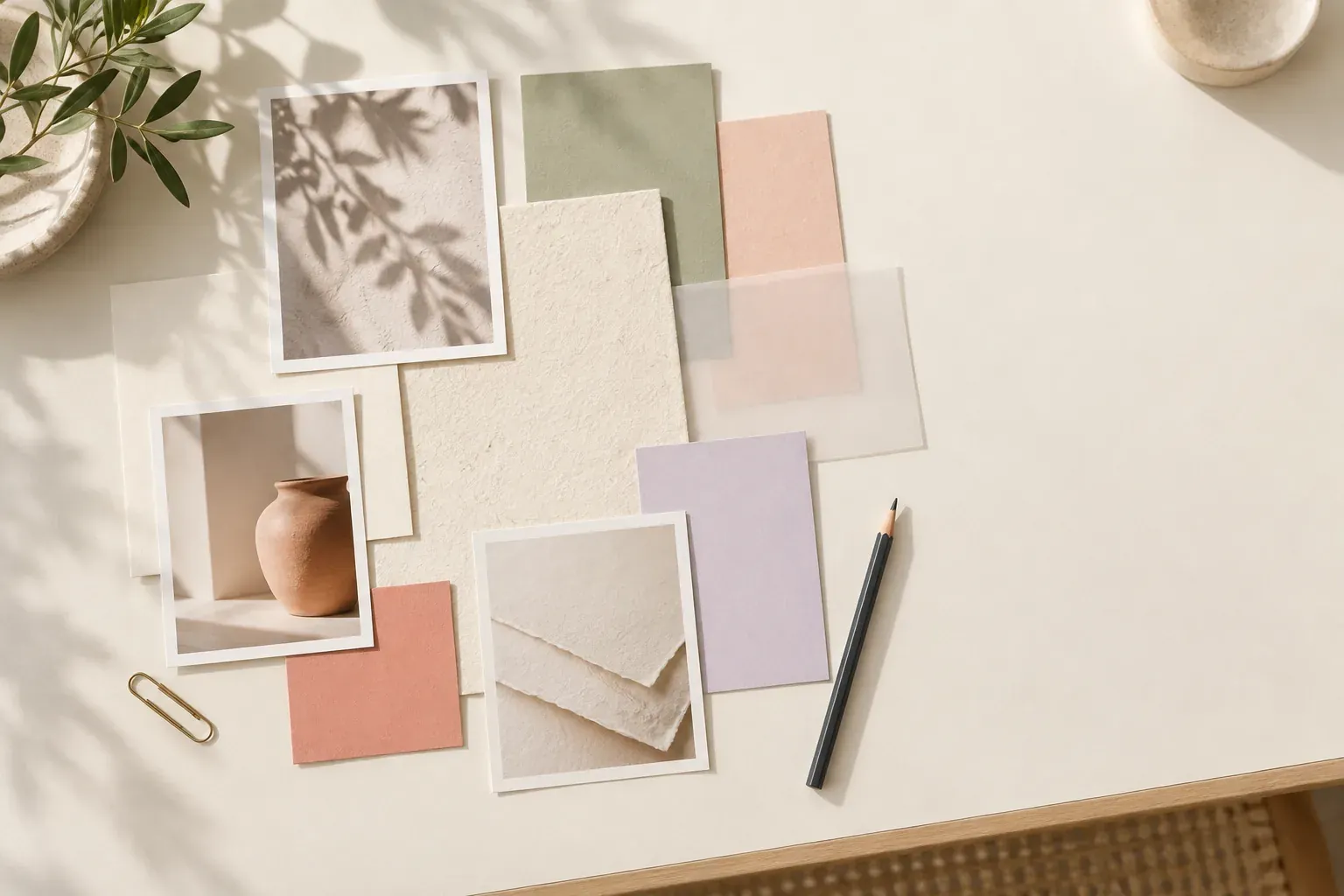
A brand mood board is a collection of visual references that sets the intended character of a brand before you design its identity. Translate a few clear attributes into choices about color, typography, photography and texture, then compare coherent directions. The board guides the brief; it is not a finished logo or a set of rules for using one.
Turn brand attributes into visual evidence
Start with the audience, offer and situation in which someone encounters the brand. “Friendly, premium, modern” is too broad to guide a design on its own. Define each word in context: friendly might mean approachable explanations rather than playful illustrations; premium might mean careful materials rather than metallic finishes. Resolve those meanings before choosing images that merely look expensive or current.
Choose a small set of attributes and write an opposite for each. “Precise, not clinical” helps you recognize when a visual direction becomes too cold. “Warm, not nostalgic” stops an appealing vintage reference from changing the intention. The opposites are guardrails, not claims about other businesses. You are defining this project, not declaring one visual style superior.
- Attribute: [the quality people should perceive].
- Meaning: [what that quality means for this audience and offer].
- Visual evidence: [a specific feature, such as generous spacing or natural light].
- Boundary: [what the direction should not become].
Annotate each reference with the attribute it supports. A beautiful image that cannot be connected to the brief belongs in the exploration folder, not the selected direction.
Scan the category without borrowing an identity
Collect a small, labeled set of examples from the category and adjacent fields. Look at the actual context: packaging on a shelf, a service page, a booking flow or a printed handout. Notice recurring type styles, palette families, image subjects and layout habits. This is a comparison exercise, not evidence that a particular style causes trust, sales or any other outcome.
Keep the category scan separate from your proposed branding mood board. Otherwise, a familiar competitor’s identity can quietly become the default answer. Record what seems necessary for recognition and what you might approach differently. A clear product label could be essential; a color used by several examples might be incidental. State the reasoning rather than trying to look different at any cost.
Retain source notes and dates for the examples you collect. Study a feature without presenting someone else’s logo, composition or imagery as your proposed identity. If the project’s purpose is still unclear, write the design brief first. A mood board can explore how to express an offer, but it cannot substitute for knowing what the offer is.
Choose color, typography, photography and texture together
Build a palette around roles: primary surface, text, supporting color and accent. Show colors in unequal proportions that reflect likely use. Four equally sized chips hide the difference between an ivory background with a coral detail and a full coral page. Treat the palette as provisional until it has been tested in actual layouts, especially where text or controls need clear contrast.
For typography, compare qualities such as narrow or wide forms, open or compact spacing, sharp or soft details, and a quieter or more expressive headline voice. Include readable sample words rather than a decorative alphabet alone. Check punctuation, numerals and the kinds of text the brand actually uses. Keep font names and license questions beside references; a mood board is not permission to deploy a typeface.
For photography, identify subject, distance, light, color and background. “Natural” might mean everyday environments, restrained retouching or soft window light; those are separate choices. For texture, say where it belongs and where it does not. Tactile packaging can coexist with a clean digital interface. Do not add paper grain to every surface merely because it looks appealing in the collage.
A palette extracted from an image can be a starting reference, but decide which colors serve the brand’s actual communication tasks before treating them as specifications.
Compare two complete brand directions
Create two boards that express the same brief through different visual decisions. Do not make one careful option and one deliberately weak alternative. Each should have a name, a short rationale, a palette, type references and an image approach. Compare equivalent categories so the decision is about direction rather than which board happens to contain more attractive photographs.
For an original fictional example, imagine a small ceramics studio that wants to feel warm and precise. One direction could use generous ivory space, close-up material photographs, a restrained type hierarchy and a clay accent. Another could use a stronger color field, crisp object silhouettes and a more compact layout. Both can support the same attributes; neither is a recommendation for a real business.
Present them at the same scale and ask the same questions: does this express the defined attributes, suit the audience’s context and work in the required formats? Avoid a vague vote on favorites. When someone wants the colors of one and typography of the other, test a third coherent arrangement. A collection of individually preferred pieces is not automatically a workable identity.
Copy this brand mood board template
Use this template for each direction, with the project brief shared between them. Keep examples and selected choices clearly labeled. A short note under each reference should explain the feature being studied, not repeat the image’s subject. Make the direction understandable without access to the whole research folder.
- Project: [offer], [audience], [main encounter], [deliverables and constraints].
- Attributes: [three qualities], each with [meaning], [visual evidence] and [boundary].
- Direction name and rationale: [short name], [one sentence explaining the visual approach].
- Color: [surface], [text], [support], [accent], [approximate roles rather than final specifications].
- Typography: [headline character], [body character], [sample text], [font and license questions].
- Photography or illustration: [subjects], [framing], [light], [background], [what to avoid].
- Material and layout: [texture], [spacing], [shape], [where each is appropriate].
- Application tests: [small screen], [print or packaging if relevant], [long text], [small-size mark].
- Decision record: [selected direction], [reason], [unresolved questions], [next prototype].
The same structure adapts to a fashion business, but garment references need their own practical checks. Keep a fashion mood board separate when silhouette, fabric and fit are part of the project, then connect the shared color and photographic intentions.
Use a web design mood board to test real applications
For a website, add references for hierarchy, image treatment and the balance of dense versus open content. A web design mood board should explain how the direction might behave, not imply that a screenshot of another site is the new design. Separate visual references from navigation requirements and user tasks; a beautiful composition may not accommodate the content you need.
Make a small application test with representative copy: a headline, a paragraph, a link, a button and an image. Include a narrow-screen version and a longer page section. Look for weak contrast, type that becomes tiring in body text and decorative details that compete with the action. If the mood disappears when real content replaces the collage, revise the direction rather than reducing the content to fit it.
Choose a board format that allows references and notes to sit together. A physical board is valuable for packaging and print materials; a digital arrangement is useful for layout comparisons and remote discussion. Keep source attribution with references, and distinguish reference imagery from assets you have permission to use. The selected direction still needs original design work and application testing.
Move from the branding mood board to a brief and style guide
Record the chosen direction in plain language before starting the identity work. Name the attributes it expresses, the visual decisions that support them and the unresolved questions. Replace “make it feel like the board” with instructions such as “use close material photography with simple backgrounds” or “keep the accent color out of long body text.” These are directions to test, not final rules.
A style guide comes after the identity has been designed and checked. It documents actual choices: approved marks, color values and roles, typography, image treatment, spacing and examples of use. Do not copy provisional font samples or arbitrary color chips into a guide as if they have been validated. Keep the mood board as the rationale behind the work rather than the specification of every output.
End the review with a decision owner and next deliverable, such as a page prototype or packaging study. For other examples of boards that lead to practical choices, see mood board examples. The useful measure is whether the board narrows the design problem and makes feedback more specific, not whether every reference looks perfectly matched.
Questions and answers
What is a brand mood board?
It is a visual direction for a brand, expressed through references for color, type, imagery, materials and layout. It supports identity design but is not itself a logo or style guide.
How do you make a mood board for a brand?
Define the audience and attributes, translate each attribute into visual evidence and gather annotated references. Build coherent directions, compare them against the same brief and test the selected direction in real applications.
What do designers use for brand mood boards?
Possible formats include digital canvases, presentation layouts, sketchbooks and physical sample boards. Choose according to the material being compared and the way the direction will be reviewed.
Can you give examples of brand mood boards?
A fictional ceramics studio could explore ivory space, clay accents and close material photographs for a warm, precise direction. A different direction could use stronger color fields and crisp object silhouettes; the point is to connect each choice to the same defined brief.
What’s one thing that shouldn’t appear on a brand mood board?
A competitor’s finished identity presented as your proposed design. Keep category research separate and explain individual qualities you are studying rather than borrowing a whole visual system.