Short answer
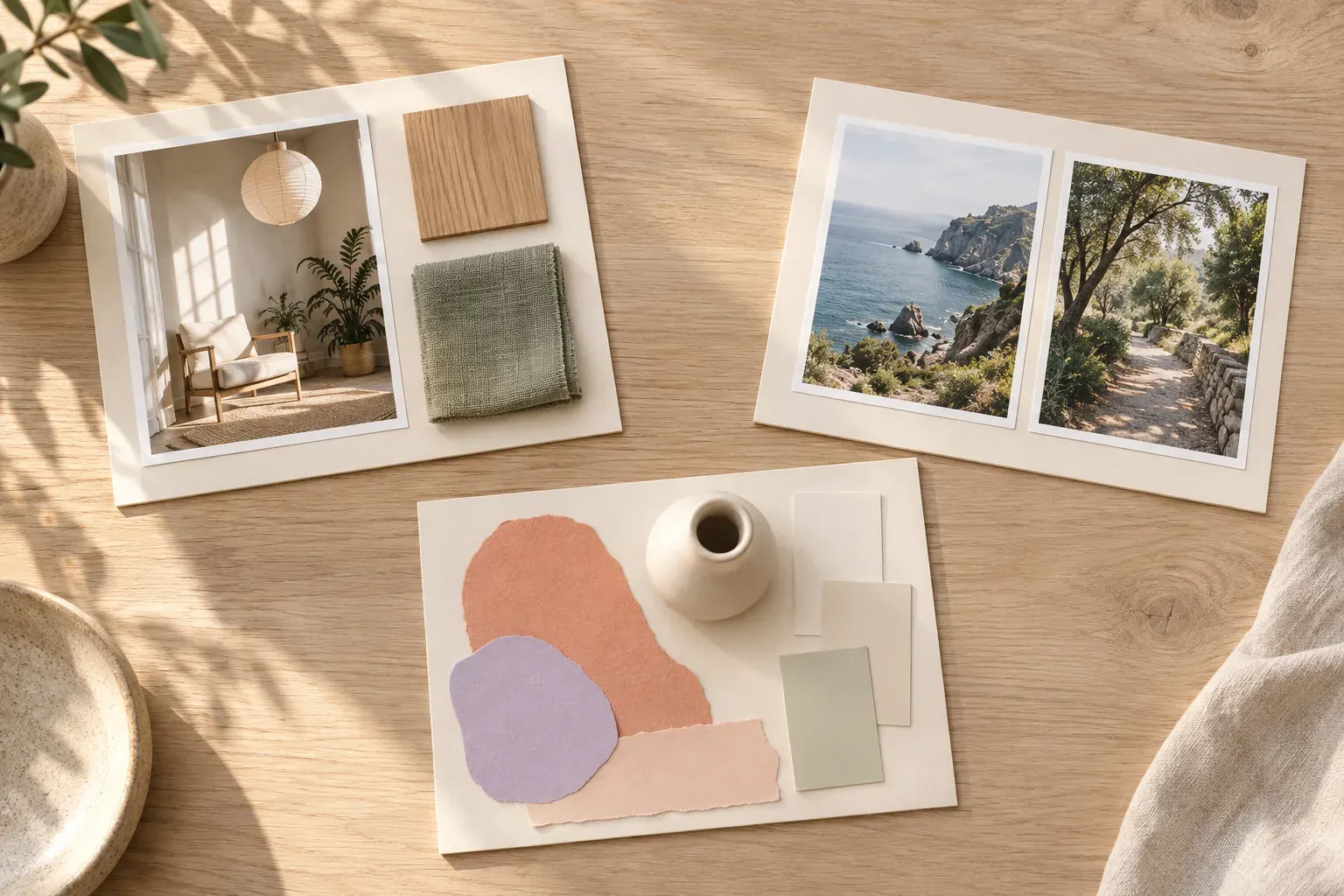
Useful mood board examples show a complete direction, not just a collection of attractive pictures. Each board below combines references with a purpose, a few constraints and a decision to make, so you can borrow its structure without copying its style.
How to read a sample mood board
Start with the question the board answers. An interior board might ask how a small room can feel restful without becoming bare. A photography board might ask how to make the same object feel bright rather than dramatic. The references only become useful when you know what they are meant to explain.
Look for three layers: an anchor image that sets the overall direction, supporting references that explain specific choices, and notes that turn those choices into instructions. A large photograph of a kitchen can establish warmth, but a close-up of wood grain and a note about avoiding glossy finishes make that warmth actionable.
The nine examples here are working structures. Three are real Canvas Perch starter templates; the other six are illustrative boards you could assemble for your own project. The starter templates contain sample notes and links, not verified field observations, live travel information or finished client work. Add your own images and sources before treating any sample as a project plan.
1. Interior mood board: Quiet spaces
The real Quiet spaces template starts with a “Morning light” frame, an intention note, a “Look for” checklist and a soft palette. The checklist names natural light across a wall, tactile linen, oak and lime plaster, and one clear place to sit. A short unattributed room reflection and a replaceable sample reading-nook link sit nearby.
It works because the desired feeling has observable tests. A room reference can be checked against light, material and seating, rather than included simply because it looks expensive. The cream, tan, muted green and dark green palette gives those references a shared color direction without prescribing a shopping list.
To complete this example for an actual room, add a photograph of the space as it is, one seating reference, real finish samples and a note about what must stay. Keep dimensions and purchases in a separate planning area. A beautiful chair is not a useful choice until you know it fits.
2–3. Travel and research boards: place with a purpose
The Kyoto notebook template is a travel notebook rather than a finished itinerary. Its “Day one” frame contains a places-to-revisit checklist, personal reminders, a short travel note and a placeholder walking-route link. The checklist includes the Philosopher’s Path at dawn, a small tea house near a canal and a bookshop with paper lanterns; the reminders suggest walking early and carrying coins and a sketchbook.
As a travel mood board, this structure works by linking atmosphere to behavior: early walks and time to sketch. Complete it with your own route photographs, a light reference and notes on the pace you want. Replace every sample location or route with checked information before planning a visit. Inspiration and confirmed logistics should remain visibly different.
The Coastal field notes template instead organizes a “North shore visit” frame, a sample low-tide field note, open questions, an observation about gulls, an unattributed reflection and a placeholder tide-table link. Its questions concern change since a previous visit, possible seasonal erosion and photographing the same spot again.
This is a research-board example, not a claim about a real shore. It works because observations and questions occupy separate cards, with a connection from the field note to the questions. Add dated photographs, source details and a clear “not yet checked” label to your own version. Do not make an uncertain explanation look like an established finding through visual proximity alone.
4–5. Brand and fashion boards: a consistent visual language
Imagine a fictional neighborhood ceramics studio that wants to feel approachable and precise. Its brand board could combine a close-up of a handmade rim, an orderly shelf photograph, two contrasting type samples and warm neutral swatches. Notes would specify “human texture, clear information” and reject distressed lettering that makes practical details difficult to read.
This works because texture and clarity have different jobs. One reference supplies character; another supplies structure. A brand mood board should explain that relationship before anyone turns it into a logo or website. Put borrowed references beside source notes, not in a box that implies they are approved final assets.
For a fictional small clothing collection, make the anchor a relaxed, straight silhouette. Support it with a sleeve detail, a fabric swatch, a shoe shape and a restrained color story. Add separate notes for proportion and movement: “room at the shoulder” says more than “effortless.” A landscape reference may suggest color, but it should not crowd out evidence about how the garments hang.
The fashion board works when the pieces could belong to the same collection without being identical. Check fabric weight and drape physically where possible. Identify the quality you are studying in a reference rather than copying another designer’s full outfit, print or distinctive construction.
6–7. Story and photography boards: mood made shootable
A fictional short-film board for a waiting scene might include an empty bus shelter, a close crop of rain on glass, a wide frame with a small subject area and a muted evening palette. Put “distance, hesitation, held frames” beside those references. Keep continuity needs, such as dry clothing becoming wet, in notes rather than expecting the pictures to explain them.
It works because the references describe a scene’s visual behavior: where the camera waits, what fills the frame and which details matter. One dramatic image cannot define every scene in a story. Use a separate board if a later sequence needs a clearly different visual approach.
A still-life photography example could show a ceramic pitcher in side light, a wider setup revealing the background and a close crop reserved for texture. Add a prop sample, a reflector position sketch and intended image orientations. A photoshoot mood board becomes useful when a photographer can translate the atmosphere into a location, lighting test and shot list.
The important distinction is between visual references and required shots. A reference can demonstrate a shadow without specifying the subject you must photograph. Mark those roles explicitly so the team does not mistake inspiration for a deliverable.
8–9. Event and product boards: keep real constraints visible
For an illustrative garden supper, put the actual table location at the center. Around it, arrange a low floral reference, fabric texture, a dusk lighting example and an understated place-setting photograph. Add notes about sightlines, access and an indoor weather option. The board should show how people will use the space, not only how an empty table might photograph.
This event board works because the venue anchors the aesthetic. A tall centerpiece can be lovely in isolation and wrong for conversation across a narrow table. Pair each major reference with a practical condition: available tabletop width, existing chairs, lighting access or something that must be rented.
For a fictional desk organizer, combine a rounded-corner form reference, a hand-sized scale comparison, a finish sample and photographs of the objects it must hold. Separate “visual direction” from “requirements.” A warm matte surface is a direction; a compartment that accommodates the intended notebook is a requirement that needs dimensions and testing.
The product board works when material, shape and use support the same goal. Do not label a reference as a manufacturing solution without checking it. A photograph cannot establish durability, safety or production cost; those belong in the specification and later evaluation.
What makes an aesthetic mood board useful?
- A clear purpose: name the project and the decision this version should support.
- Hierarchy: make the overall direction easier to notice than a minor detail.
- Variety with a reason: include light, material, shape or composition evidence, not repeated near-duplicates.
- Annotations: say which quality to borrow and which parts of a reference to ignore.
- Boundaries: distinguish sample content, open questions and settled choices.
- Traceable sources: keep ownership and permission details beside borrowed work.
Review the board without explaining it aloud. Can another person identify the intended direction and the next decision? If not, add a precise note or remove a distracting reference. Coherence matters more than filling every empty space.
A reusable mood board template
- Purpose: We are making [project] for [audience or use], and this board decides [question].
- Direction: Use three descriptive words, each supported by a visible reference.
- Anchor: Add one image that best represents the overall feeling.
- Evidence: Add supporting color, material, form and composition references.
- Limits: Record what must stay, what is unavailable and what to avoid.
- Next decision: Name the choice, its owner and what still needs checking.
Adapt the structure to your field rather than copying an example’s exact objects. For the collecting and editing process, follow how to make a moodboard. Stop when the board gives you enough evidence to make the next choice, not when it looks completely full.
Questions and answers
Can you give some examples of mood boards?
Examples include an interior board of light and materials, a brand board of type and imagery, a fashion board of silhouettes and fabric, and a photography board of lighting and framing. Each should support a specific project decision.
What should a sample mood board include?
Include a purpose, an anchor reference, supporting colors or materials, brief annotations and source details. Label sample or unverified content so it is not mistaken for a final choice.
How many pictures should be in a mood board?
There is no fixed count. Keep enough references to explain distinct choices, then remove near-duplicates and anything that does not change the direction.
What is an aesthetic mood board?
It is a board that explores a shared visual feeling through references such as color, texture, light and composition. For project work, attach that feeling to a purpose and practical constraints.
What should not appear on a mood board?
Avoid unexplained references that contradict the direction, private material shared without permission and borrowed work presented as your own. Keep unrelated ideas in a separate collection.