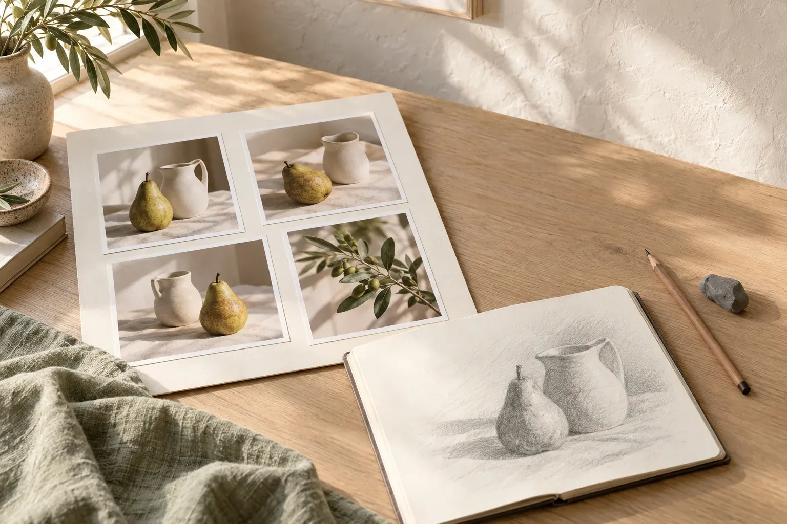
Short answer
Drawing from reference photos means using observed shapes, proportions, light and details in a photograph to inform your drawing. Start with one clear main reference, block in its large forms, and compare relationships before adding detail. A reference board keeps supporting views and source notes together without asking every image to direct the same drawing.
Decide what the reference is there to teach
A photograph can answer a specific question: how a handle attaches to a pitcher, where a shadow falls, or what a bent leaf looks like from the side. It becomes less helpful when you ask it to supply a finished composition, a color scheme, an unfamiliar pose and a personal style all at once. Write one learning goal before selecting the image.
For a first still-life study, choose a simple subject with readable edges and one clear light direction. A pear beside a plain cup gives you rounded volumes, a contact shadow and an ellipse to compare.
An art reference board differs from a mood board: the mood board establishes a feeling, while the reference board answers construction questions. You can keep both for a larger project, but label their purposes so atmosphere does not quietly override the form you are studying.
Find reference photos with a clear source and permission
Start with photographs you take yourself when possible. Photograph a mug from several angles, a folded cloth beside a window, or a plant against a plain background. Keep the camera height and light direction consistent for a set of related views. If you photograph another person, discuss the intended use and their comfort with sharing the image; ownership of the camera does not settle every privacy concern.
Other options include images whose source explicitly marks them as public domain, openly licensed collections and photographs used with the creator’s permission. Follow the image back to its original page. A repost, search thumbnail or saved pin is a discovery route, not a reliable statement of what you are allowed to do. Record the creator, source link, license and any conditions while you can still find them.
The official Creative Commons license overview explains that licenses differ: some require attribution, some restrict commercial use, and some do not permit adaptations. Do not treat “Creative Commons” as one blanket permission. Check the exact license and your intended use, particularly before publishing, selling or distributing a closely reference-based work.
This is a practical source-keeping caution, not legal advice. If a photograph’s terms are unclear or do not fit the project, choose another source or ask for permission. Keep any permission record with the reference rather than relying on a memory of a message.
Build a reference board around one main view
Make the main reference larger than the others and give every supporting image a job. One may clarify a hidden handle; another may show the same material in softer light. Avoid collecting many slightly different compositions simply because they are attractive. Too many competing views can make you change the drawing’s perspective halfway through.
- Main view
- The image that establishes camera angle, proportions, pose and the composition you are studying.
- Construction reference
- A supporting view that explains an obscured form, joint, surface or object detail.
- Light and value reference
- A view with clear shadow shapes and a readable separation of light, middle and dark areas.
- Color or material reference
- An image used for a limited quality, such as glazed ceramic highlights or the muted greens of a leaf.
Put a short note beside each supporting view: “handle attachment only,” “leaf edge,” or “warm reflected light.” Keep the source and permission note below it. Leave room for your own thumbnails, measurements and observations. The board should contain evidence of looking, not just evidence of collecting.
For a related color study, getting a color palette from an image can help you separate the photograph’s color family from its composition. Keep those swatches subordinate to the main view when the exercise is about drawing rather than palette design.
How to draw from a reference photo, step by step
Use a repeatable sequence so you know what to compare when something looks wrong. For the pear and pitcher example, do not begin with the pear’s tiny surface marks. First establish the tabletop, the objects’ relative heights and the gap between them. A detailed texture cannot repair a pitcher whose base sits on a different plane.
- Study the image before drawing. Identify the largest shapes, the light direction and where the subject touches its surroundings.
- Draw a small thumbnail. Place the overall envelope of the subject and the biggest light and dark masses without detail.
- Block in the main forms lightly. Use a few simple volumes and broad angles rather than tracing a complicated outline in one pass.
- Compare proportions. Check one dimension against another: pitcher height to pear height, handle width to body width, or the gap to the pear’s width.
- Check negative spaces. Compare the opening inside the handle and the shape between the objects as carefully as the objects themselves.
- Place shadow shapes. Keep the first value groups simple, then refine transitions where the form turns away from the light.
- Add selective detail. Develop the edges and small marks that explain the form, and leave distractions out.
- Compare again. Mark one structural difference to improve rather than declaring the whole drawing good or bad.
Keep the photograph and drawing at comfortable visible sizes. After examining a tiny area, return to the whole image to check that the detail belongs to the larger form.
Study the photograph without inheriting every distortion
A photograph is a view of a subject, not the subject itself. A close camera position can make nearby forms appear disproportionately large; a bright highlight can hide an edge; a dark area can conceal structure. If a shape seems confusing, compare another angle of the same object or look at a similar object in front of you. Do not invent a detailed solution merely because the photograph is unclear.
When combining references, choose which image controls the viewpoint and lighting. A handle copied from a high angle may not fit a pitcher drawn from a low angle. A leaf lit from the right will not automatically belong in a scene lit from the left. Supporting references explain anatomy or structure; they do not exempt the final drawing from a consistent arrangement.
Try a small observation exercise: draw the main forms while viewing the photo, put the photo aside and sketch the arrangement from memory, then compare. Note which relationships you understood and which you only followed. The point is not to prove that memory drawing is better. It is to discover what you still need to examine.
Separate a study, an interpretation and a copied composition
A close observational study has a different purpose from a finished original composition. Label a study honestly in your notebook and keep its source. If you share it, describe the role of the reference rather than implying that you devised the photograph’s arrangement. Credit is useful for transparency, but credit alone does not replace permission where permission is needed.
For an interpretation, decide what you are changing and why: a simpler crop, a different grouping, a more restrained value range or an invented setting. Use references to solve specific construction problems inside that plan. Combining several images is not a numerical formula for originality, and changing an arbitrary percentage does not settle permission or attribution questions.
Keep your project intention beside the references. A short design brief can say what the drawing is for, what it needs to communicate and which choices are yours to make. That makes it easier to reject a beautiful reference that points toward a different result.
Choose a reference-board workflow you can keep tidy
Paper prints are useful when you want the references beside a sketchbook without switching windows. A digital reference board is useful when you need to rearrange images, compare crops and keep source links nearby. There is no universal best app for drawing reference images. Test whether your workflow keeps the main reference visible, supports the notes you need and lets you return to the original source.
After a session, remove duplicate views and note one observation, such as “the handle opening was narrower than I first drew it.” Archive possible future subjects separately.
If source material is scattered across bookmarks, the guide to moving from bookmarks to ideas offers a broader sorting approach. Finish with one main image and one concrete drawing exercise.
Questions and answers
How do I draw from a reference photo?
Choose a readable image and start with large shapes, relative proportions and simple shadow masses. Compare negative spaces and alignments before adding small details. Keep returning to the whole image rather than finishing one isolated area first.
Where can I get reference photos for drawing?
Use your own photographs, images with clear public-domain or license information, or photographs used with the creator’s permission. Keep the original source and check the terms against your intended use, especially before sharing or selling reference-based work.
Where can artists find free reference photos?
Look for collections that explicitly state the permissions for each image, rather than assuming that a downloadable photo is free to reuse. Public-domain and openly licensed sources can be options, but the image’s specific terms and any required attribution still matter.
What is the best app for drawing reference images?
Choose by the drawing task rather than a ranking. You need a comfortable view of the main image, a way to compare supporting references and somewhere to keep source notes. Printed references may be enough for a small study.