Short answer
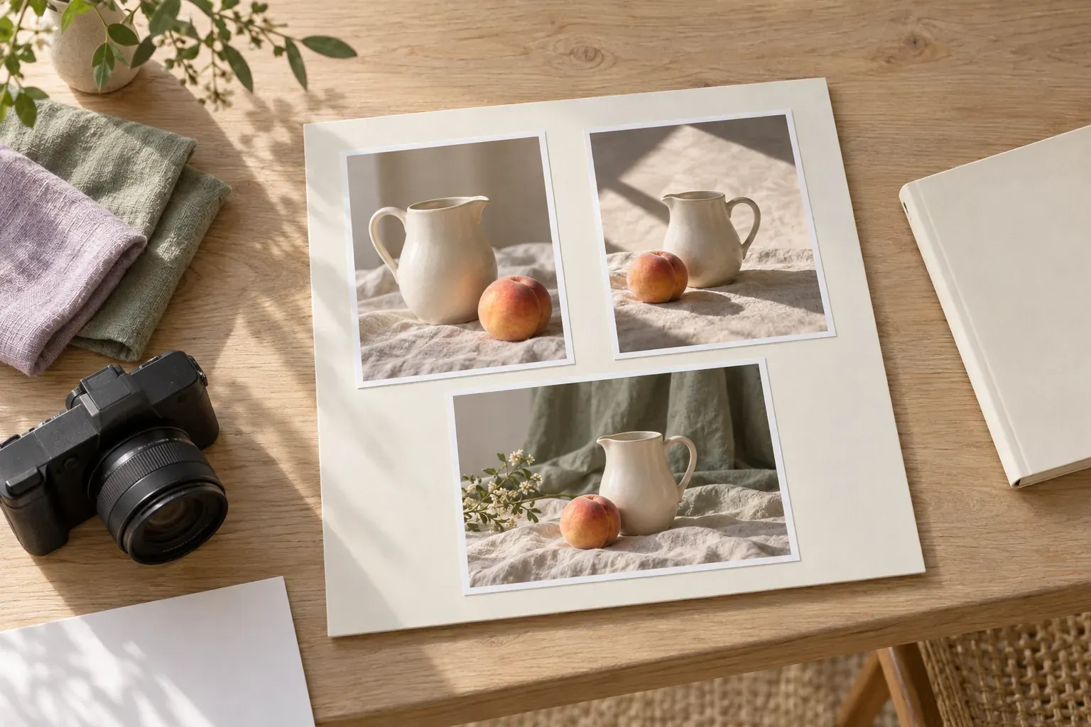
A mood board for a photo shoot is a compact visual plan for the light, location, styling and framing you want to create. Combine annotated references with actual scouting photos and a separate shot list, so everyone can distinguish the intended feeling from the images you must deliver.
Define the shoot before collecting photography references
Write the assignment in one sentence: what you are photographing, who will see the images and what those images need to communicate. “Photograph handmade bowls for a product page, with enough detail to judge shape and glaze” is more useful than “make it beautiful.” It gives every reference a job and makes technical needs visible early.
Then record the intended uses. A wide header, a square crop and a close product detail ask for different compositions. Note whether space is needed for text, whether the subject must be shown accurately and which backgrounds or objects cannot appear. These constraints belong near the top of the board, not in a message someone may miss.
Use one board per shoot, with clearly labeled areas for setup variations. If two proposed directions disagree about light, location and styling, compare them as separate options before combining them. A single board full of incompatible references leaves the photographer to guess which one wins.
For the written assignment that sits behind the visuals, use a design brief template. Keep the brief focused on purpose and deliverables; let the board explain how those requirements might look.
Show the light, not just the mood
Choose lighting references that make the important qualities visible: shadow edge, direction, contrast and the relationship between subject and background. A soft window-lit scene and a hard sunlit scene may share a pale palette while requiring very different setups. Name the quality you want instead of relying on a loose label such as “natural.”
- Soft and intimate
- Use a reference with gentle transitions between light and shadow. Note where the light enters and whether the background remains quiet or bright.
- Bright and crisp
- Show the shadow shape and highlight behavior you want. Identify where strong contrast is welcome and where important detail must remain visible.
- Low-key and restrained
- Choose a reference where the subject separates from a darker setting. Explain which details should emerge rather than asking for indiscriminate darkness.
Add a simple setup sketch or a test photograph when available. Mark the light’s approximate direction, a possible reflector position and what you can change. Do not claim to know a reference photograph’s exact equipment or settings from its appearance. Recreate the relevant effect through tests rather than treating a guessed setup as fact.
Add actual location and styling evidence
Location inspiration tells you what you like; scouting photos tell you what is possible. Include an overview of the actual space, the background you expect to use and a view showing windows or obstructions. Record when the scouting photo was taken. If the plan depends on daylight, check the location near the intended shoot time rather than trusting a photograph from another season.
Keep access, permission, weather alternatives and practical restrictions in plain notes. An appealing doorway may be inaccessible, a quiet-looking room may have limited space for equipment, and a background may include objects that cannot be moved. Flag those conditions before they become shoot-day surprises. Do not put sensitive addresses or access codes on a broadly shared board.
For wardrobe and props, show the actual candidates where possible. Compare color, texture, scale and reflectivity against the proposed background. A shiny vase changes the lighting problem; a fine repeating pattern may need a camera test. Use swatches or quick test images to check how combinations behave, rather than treating separate attractive references as a guaranteed match.
If clothing is central to the assignment, a separate fashion mood board can develop silhouettes and fabrics. Bring only the selected styling direction back into the shoot board, with an owner for sourcing each required piece.
Translate posing and framing into clear instructions
Group framing references by purpose: wide scene, medium composition and detail. Annotate camera height, subject placement, background relationship and usable negative space. If a reference is there only for its crop, say so. Otherwise a teammate may assume its lighting, wardrobe and location are also instructions.
For portraits, discuss the intended energy and comfortable movement rather than asking someone to become the person in a reference. “Seated, shoulders relaxed, looking slightly past the camera” gives a starting point without demanding an exact imitation. Agree on boundaries and any sensitive styling or poses in advance, and leave room to adapt on the day.
For products or still life, identify the view needed to explain the object. A low angle can emphasize height but conceal the inside of a bowl. A texture detail cannot replace an overall shape view. Pair atmosphere references with factual views so the shoot can communicate both feeling and useful information.
Check the planned crops before approval. Show a rough rectangle for each important orientation and ask whether the subject still works inside it. Keep breathing room where a layout needs it, but do not guess where final text will sit if a designer can provide the actual requirements.
Set a color direction without promising an exact match
Use a small set of references to describe color temperature, saturation and tonal contrast. “Warm background, natural product color, gentle contrast” is more specific than “vintage.” Distinguish decisions made during styling and lighting from adjustments considered afterward. A filter cannot solve an unsuitable background or a missing highlight in every situation.
Where color accuracy matters, say which parts must remain faithful to the subject. A mood reference may suggest warmth without authorizing a change to a garment’s or product’s apparent color. Note the intended viewing context and discuss how color will be reviewed. Screens and printed samples are different checks, not interchangeable assurances.
A color palette from an image can help name a direction, but sampled colors are not camera settings or a retouching recipe. Keep a short note explaining what the palette represents and which aspects remain open for testing.
A copyable photography mood board template and shot list
- Assignment: Photograph [subject] for [use], communicating [specific quality].
- Deliverables: List required images, orientations, crop needs and any agreed file requirements.
- Light: Add one main lighting reference, an annotation about shadows and a setup or test photo.
- Location: Include current scouting photos, access notes and a weather or availability alternative.
- Styling: Show selected wardrobe, props and background materials; name who supplies them.
- Framing: Include wide, medium and detail references, with notes on viewpoint and negative space.
- Color and finish: State the intended temperature, contrast and what must remain accurate.
- Decisions: Label confirmed choices, tests still needed, review owner and the next review date.
Keep the shot list alongside the board as a separate production checklist. For an illustrative ceramic-bowl shoot, it might read: overall view on an ivory background; overhead interior view; glaze detail; wider table scene with clear space to the right. Give each required shot an identifier, setup, orientation, priority and completion box. These are sample deliverables, not an assumed standard for every assignment.
Order shots by setup where practical, so you can see when light, props or backgrounds change. Include a fallback for the highest-priority image if time or conditions become limited. Do not let optional atmospheric photographs quietly displace required views.
Review with the crew and keep permissions separate
Before the shoot, ask each person to review the part they own: the photographer checks light and framing, styling checks materials and sourcing, and the person approving delivery checks required images. If models or other participants are involved, share relevant references early and invite questions about comfort and expectations. Confirm who resolves conflicting feedback.
- Does everyone understand which references are inspiration and which are approved requirements?
- Can the planned location, equipment and styling produce the proposed direction?
- Are priority shots, crops, sourcing responsibilities and open tests explicit?
- Have you confirmed necessary location permission and participant consent, including intended image use?
- Is there an agreed current version, with superseded directions clearly removed or labeled?
A mood board is not a model release, location agreement or license for borrowed reference images. Where releases or other agreements are needed, handle them separately with appropriate advice for the intended use and jurisdiction. Sharing an inspiration image with a team does not automatically make it available for public publication.
For more structures you can adapt, see mood board examples. The final test is practical: can the team use this board to prepare, make decisions and recognize when a shot meets the assignment?
Questions and answers
How do you make a mood board for a photoshoot?
Define the assignment and deliverables, then collect annotated references for light, location, styling, framing and color. Add actual scouting or test photographs and review the board alongside a separate shot list.
What is a photography mood board?
It is a visual plan that communicates the intended look and feeling of a shoot. It helps explain creative choices but does not replace production logistics, permissions or the required-shot checklist.
What are examples of photography mood boards?
Examples include a window-lit still-life board, a portrait board focused on relaxed movement and a fashion shoot board combining wardrobe, location and framing. Each should show how the references relate to one specific assignment.
What are examples of photo moods?
A photograph can feel quiet, playful, tense, intimate or expansive. Explain the mood through visible qualities such as shadow, distance, color and composition rather than using the adjective alone.