Short answer
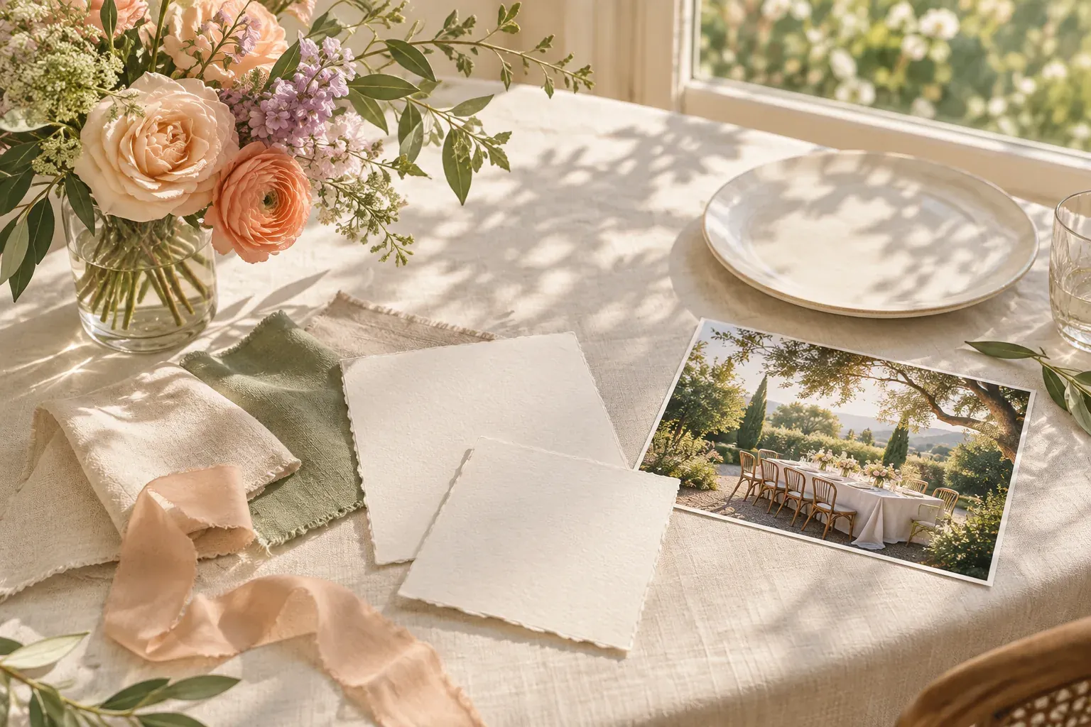
A wedding mood board is a curated collection of images, colors, materials and notes that communicates how you want the celebration to feel. Start with your venue, season and shared priorities, then select references for flowers, attire, stationery, tables and photography. Explain what each image contributes so the board becomes a direction to discuss, not a promise to reproduce everything shown.
Start with the people, venue and season
Before saving more photographs, write one sentence together about the experience you want to host. “A relaxed garden meal with room to talk” gives you more to work with than “beautiful and timeless.” Add the practical boundaries you already know: the venue’s existing surfaces, the season, indoor or outdoor space, guest needs and a spending limit you are comfortable discussing.
Photograph the venue if you can, or use images the venue permits you to reference. Look at what is already there: floor color, walls, chairs, surrounding plants and the available light. A board that includes those fixed elements is easier to interpret than one composed entirely of unrelated styled scenes. An elaborate flower installation in a photograph may not suit your actual space or priorities.
If partners have different starting ideas, collect a small group separately and explain each choice before merging. One person may be responding to informal seating while the other is noticing muted color. Those qualities can coexist even when the original photographs look very different. Keep disagreements visible as questions rather than letting the most confident collector quietly decide the whole direction.
Use a wedding mood board template with clear categories
Create a compact main board for the overall direction and use supporting notes for details. You do not need a separate board for every item, but the categories below help reveal missing decisions. Put your intention and known constraints at the top so a vendor does not have to infer them from the images.
- Setting and season
- Your actual venue, the light you expect and the parts of the setting you want to work with rather than cover.
- Palette and materials
- A small group of colors plus paper, linen, glass, wood or other relevant textures.
- Flowers and greenery
- The shape, scale and looseness of arrangements, with availability left as a question for the florist.
- Stationery and signs
- The visual character of invitations and practical information, including legibility and contrast.
- Attire and tables
- Fabric qualities, level of formality, place settings and how people will sit and move.
- Photography
- References for light, framing and the balance of candid moments and arranged portraits.
- Decisions and open questions
- What is agreed, what needs a sample or estimate and what is explicitly not part of the plan.
Under each reference, finish the sentence “We chose this because…” If you cannot explain its role, move it out of the main board. Label exploratory images separately from approved choices; “considering” and “confirmed” should never look identical.
The general guide to making a mood board covers collecting, grouping and editing before presentation.
Make the color palette work with real materials
Choose a small palette with different jobs: a base, a supporting color and an accent. For a garden setting, an example might be warm ivory for larger surfaces, sage in linen and peach in flowers. This is a possible direction, not a rule or a statement about which colors will be available. Use your venue and preferences to decide the balance.
Place texture samples beside the colors. An ivory cotton, glossy ceramic and handmade paper can read differently even when their colors seem close on screen. Consider how materials look together rather than demanding an exact digital match across flowers, cloth and print. Request physical samples when a match matters, and examine them in relevant light before deciding.
The guide to a color palette from an image offers a starting method for selecting colors. An extracted screen color is still a reference, not a specification for every physical object. Ask the person supplying the material how best to describe or sample the desired result.
Check functional details too. Printed directions and table information need to be readable. A pale palette does not require pale text, and a fabric you love may not be practical on every surface. Keep those constraints in the notes rather than solving them by adding more decorative images.
Edit flowers, attire, stationery and tables into one direction
A wedding inspiration board becomes clearer when the categories reinforce a few shared qualities. For example, “loose, tactile and informal” could appear in unstructured foliage, textured paper and relaxed table arrangements. The categories do not need identical colors or matching motifs. Repetition of a feeling can be enough.
Crop or annotate a reference to identify the relevant detail. You might like a photograph’s low arrangement but not its flowers, or its paper texture but not its lettering. Write that distinction explicitly. Otherwise a vendor may reasonably interpret the whole image as a request, including details you never meant to choose.
- Flowers: explain shape, height and density; ask about suitable seasonal options rather than insisting on an unverified variety.
- Attire: describe comfort, texture and formality; do not make another person’s body the reference standard.
- Stationery: separate expressive details from information guests need to read quickly.
- Tables: note sightlines, movement, available space and whether people can comfortably talk across the arrangement.
Remove duplicate images and incompatible alternatives from the main board. Keep a separate comparison area if two directions still need discussion. A clear board does not hide uncertainty; it gives uncertainty a labeled place so it cannot be mistaken for a final instruction.
Build a wedding photography mood board around qualities
A photography board works best as a conversation about qualities, not a demand to recreate someone else’s day. Choose references for light, distance, composition and emotional tone. You might prefer wider frames that show the setting, quiet close details or informal groups. Explain what you notice rather than using a broad word such as “cinematic” without examples.
Keep must-have people and practical coverage needs in a separate list. A family grouping, an accessibility consideration or a moment that matters to you is different from an aesthetic reference. Discuss timing and feasibility with your photographer using the actual venue and schedule. A photograph made in different weather or a different room cannot establish what your own light will be.
The photoshoot mood board guide explains how to separate visual references from production decisions. For a wedding, keep the reference set small enough to discuss and leave room for the photographer’s interpretation of the real event. Credit sources and avoid treating another photographer’s work as a guaranteed deliverable.
Use a decision checklist, then stop collecting
Once a direction is agreed, move from image gathering to a short decision list. Write the next action, who will take it and what information is needed. “Request linen samples” is useful; “tables” is not an action. Date your board and mark revisions so a recipient can tell which palette or arrangement is current.
- Agree on the intention and the practical boundaries.
- Choose the main palette and identify any samples needed.
- Check the proposed direction against venue constraints.
- Ask each vendor the questions relevant to their work.
- Record decisions only after they are actually confirmed.
- Remove obsolete references from the current shared version.
Canvas Perch supports checklists and personal reminders with explicit time zones; the reminders and calendar documentation explains them. Use a reminder for a decision you choose to revisit, not to assign work to a vendor or imply that the board manages the event.
A good stopping point is when another image no longer changes the direction. Avoid collecting out of fear that a more impressive wedding exists somewhere online. Your board should support the celebration you are planning, including what you choose not to do. It is a communication tool, not a measure of how much you spend or how closely your day resembles a photograph.
Questions and answers
How do I create a wedding mood board?
Begin with the venue, season and an intention you agree on. Collect a small set of references for the palette, materials, flowers, tables and photography, then explain what you want to borrow from each one.
What are some creative themes for a wedding day?
Start with something personal, such as a shared garden, a favorite season, a family gathering or a place that matters to you. Describe its qualities rather than requiring a literal motif on every object.
What are some mood board mistakes to avoid?
Avoid unlabeled alternatives, duplicate images and references that ignore your venue or practical limits. Explain which detail you like so an inspiration image is not mistaken for a request to reproduce everything in it.
What should not appear on a wedding mood board?
Leave out sensitive guest information, payment details and private correspondence in a shared version. Images with no clear role in the direction also belong outside the main board.
How many pictures should be in a wedding mood board?
There is no required number. Use enough to explain the setting, palette and key categories, then stop when an additional image repeats rather than clarifies the direction.