Short answer
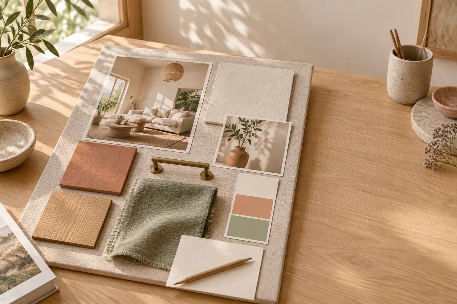
An interior design mood board brings room photographs, colors, materials and furniture references together to set a direction before you buy or renovate. Start with the actual space and a short brief, then choose references that support how the room needs to work. Check the final palette with physical samples in the room, not only on a screen.
Start the interior mood board with the room you have
Before collecting beautiful rooms, photograph your own from each doorway and corner. Include the floor, windows, trim and anything that must stay. A dark inherited cabinet or a cool gray tile is part of the palette even if it never appeared in your inspiration folder. Take a daytime photograph and another with the lights you normally use in the evening.
Write a brief that connects atmosphere to daily life: “A warm, uncluttered living room for reading, playing and hosting two friends, with the existing sofa.” Name the users, activities, storage needs and maintenance limits. “Calm” is not enough if you also need space for craft supplies or a dog bed. Choose three qualities, then explain what each means in this room.
- Keep: existing furniture, finishes and meaningful objects that must remain.
- Change: the specific problems you are solving, such as glare or insufficient storage.
- Limits: available space, project budget, rental restrictions and installation constraints.
- Decide next: the first choice that would unlock the others, such as a wall color or rug.
Collect references for qualities, not complete rooms
Choose one or two anchor photographs for the overall feeling, then collect details that answer different questions. A chair can show a curved silhouette, a close-up can explain a woven texture, and a window photograph can show the kind of filtered light you want. Avoid treating a photographed room as a shopping list: its proportions, orientation and hidden storage may be unlike yours.
Put a short annotation beside every reference. “Low furniture keeps the window visible” is more useful than “love this.” Crop a photograph to the detail you mean when the rest sends a conflicting message. Keep the source beside the crop so you can return to the original context and distinguish an inspiration image from an item you intend to purchase.
Remove references that only repeat an existing point. If half the board argues for pale, matte surfaces and half for glossy, dark drama, separate the directions rather than hoping they will blend. The broader guide to what a mood board is explains why a board needs an intention, not just a shared color.
Build a material board beside the color palette
A material board focuses on the physical finishes: wood, stone, tile, paint, fabric and metal. It can sit beside your interior mood board or form one section of it. Show the surfaces that will occupy the most space first. A floor finish and a curtain fabric influence the room differently from a small brass knob, even when their samples happen to be the same size.
Give each color a role: broad background, large furnishing, supporting material or small accent. Use fewer competing accents when the existing floor or furniture already has a strong color. Notice undertones by putting samples together. An ivory that looks neutral alone may feel yellow beside a cooler upholstery fabric. Screen images are useful for comparison, but do not establish a paint match.
- Label each sample with its material, finish, supplier reference and intended location.
- Keep uncertain alternatives separate from the selected palette.
- Include texture and sheen: matte, brushed, glossy, smooth or heavily woven.
- Check cleaning needs, wear and suitability before treating a sample as an approved choice.
Choose furniture and lighting without losing scale
Once the materials agree, add the major furniture shapes. Look at height, visual weight and repeated lines, not only style labels. A room can combine old and new pieces if their proportions work together. Show the sofa you are keeping next to the proposed chair and table, rather than surrounding it with unrelated photographs that conceal the difficult comparison.
Record dimensions beside purchase candidates and check them against a measured plan. A mood board cannot show whether a drawer opens, a dining chair clears a wall or a delivery fits through the stairs. Mark the footprint on the floor when a size feels uncertain. Keep a separate purchasing list so an attractive reference does not accidentally become a committed order.
For lighting, include both the fixture’s form and the task it needs to serve. Reading, preparing food and creating a softer evening atmosphere are different jobs. A pendant photograph tells you little about glare or the light reaching a work surface. Note the questions you need to resolve, and involve a qualified professional where electrical work or installation requires one.
Copy this interior design mood board template
Use this structure for a single room. Keep the brief visible while arranging the references, and make the room photographs a substantial part of the board rather than a tiny afterthought. For a whole home, create a shared palette first, then a separate board for each room so functional differences remain clear.
- Room and intention: [room name], [who uses it], [main activities], [three qualities with explanations].
- Existing conditions: [room photos], [measurements], [daylight], [finishes and furniture to keep].
- Atmosphere references: [anchor images], each annotated with the quality to borrow.
- Palette and material board: [background], [wood or floor], [textiles], [metal], [accent], with sample references.
- Furniture and lighting: [key shapes], [dimensions], [task served], [candidate rather than approved item].
- Constraints and open questions: [budget], [maintenance], [lead-time questions], [installation limits].
- Decisions and next actions: [selected direction], [samples to check], [person responsible], [next review].
For an atmosphere-led starting point, Canvas Perch’s Quiet spaces template is a moodboard for material, light and atmosphere. Use the structure above to add your room’s practical constraints; a template should not choose the room for you.
Choose a physical, digital or combined home decor board
A physical home decor mood board lets you handle fabric and see real finishes together. Pin or place samples so they can be removed for testing. Avoid fastening a heavy tile to a lightweight display board without a suitable support. Photograph the arrangement before taking it apart, and keep the labels attached so a beautiful anonymous sample does not become a dead end.
A digital board is useful for rearranging images, keeping source notes and comparing furniture options. Make the main direction readable at a glance, then put detailed specifications in an adjacent list. Choose a tool according to that work: arranging references is different from drafting a measured floor plan. No board format replaces the measurements or technical drawings a project may require.
A combined approach is practical: gather and edit digitally, then assemble a smaller physical sample set for the final check. If you are also choosing a visual direction for a studio or business, a brand mood board answers a different question from the room board. Keep the two related without making every brand color a wall color.
Check real light, then present the decisions clearly
Take the shortlisted samples into the actual room. Use a larger paint sample where possible and follow the product’s preparation instructions. Compare it beside the floor, upholstery and trim during the day and under the intended evening lighting. Put a curtain sample near the window and a wood sample near the surface it will meet. Note what changes rather than trusting your memory.
When presenting to a client or another person at home, begin with the brief, not a tour of every saved image. Explain the anchor reference, palette and three or four consequential decisions. Say what is settled, what is provisional and what needs a physical check. Ask “Does this storage approach support your routine?” rather than only “Do you like it?”
Record feedback as decisions or unresolved questions, then remove superseded alternatives from the main board. Finish with a next-action list before buying. For more ways to make references legible, compare the mood board examples. A successful interior board is not the most elaborate collage; it is the one that makes the next room decision easier.
Questions and answers
What is a mood board in interior design?
It is a set of room images, colors, materials and furnishing references that communicates a room’s intended look and feeling. It sets direction but does not replace a measured layout or technical specification.
How do you make an interior design mood board?
Photograph the actual room, write a brief and gather references for specific qualities. Edit them into one direction, add a palette and material samples, then check scale and real lighting before approving purchases.
What do interior designers use for mood boards?
Possible formats include sample boards, pinboards, sketchbooks, slide layouts and digital canvases. Choose physical samples for finish comparisons and a digital layout when rearranging references or reviewing remotely matters more.
How much do interior designers charge for a mood board?
Ask for a quote based on the scope rather than assuming a standard fee. Clarify whether the work includes a consultation, sourcing, physical samples, revisions and a purchasing list; those are different deliverables.
What’s one thing that shouldn’t appear on an interior mood board?
An unexplained reference that contradicts the brief. If you cannot name what you want to borrow from it, remove it or keep it in a separate exploration folder.