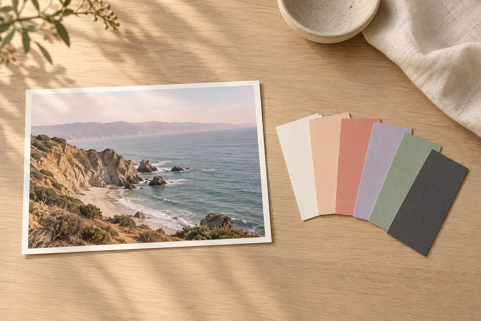
Short answer
To get a color palette from an image, sample selected areas with a color picker or use an extractor that summarizes recurring pixel colors. Then edit the result into a small set with distinct jobs, such as background, text and accent. Extracted colors are a starting point, not a guarantee of readable text or an exact physical paint match.
Choose a photo for the palette you actually need
Start with a photograph that contains the relationships you want: warm stone against cool water, a pale room with a dark timber accent, or a flower against muted foliage. The subject alone is not enough. Two photographs of the same coast can lead to very different palettes if one is brightly lit and the other is taken after sunset.
Decide what the palette will support before extracting it. A painting study may need several closely related shades. A presentation needs a legible dark and light pair. An interior scheme needs physical samples checked in the actual room. Write the intended feeling and use beside the source, then keep the original image so you can revisit which relationships made it appealing.
For a broader direction, build a brand mood board around the palette rather than asking the colors to do all the work. Shape, typography, texture and photography can express qualities that a row of swatches cannot.
Extract colors from an image manually
A manual picker is useful when the visually important color occupies only a small part of the photo. You choose the areas instead of letting pixel frequency decide. Open the image in a tool with an eyedropper and color-value display, then sample a few representative regions. Avoid a specular highlight or deep shadow if you want the object’s middle tone rather than the lighting effect.
- Sample a broad light area for a possible background.
- Sample a broad middle tone that carries the photo’s overall character.
- Sample a darker region for an anchor, then test whether it is dark enough for the intended text.
- Sample one small accent that makes the image distinctive.
- Compare several nearby pixels before choosing a value; texture and compression can create local variations.
- Record the selected values with the source and a note describing each role.
Chrome has a built-in picker in DevTools. The official Chrome Color Picker documentation describes opening Elements, finding a color declaration in Styles and clicking its preview square. Activate the Eyedropper, click the desired screen color, and copy the displayed value. Choose hex if that is the format you need; this is a developer-tool workflow, not a dedicated photo-palette generator.
Keep sampling deliberate. A set of almost identical beige pixels may accurately represent a wall, but it leaves you without a useful accent or strong text color. The point of manual selection is to preserve the relationships you noticed, not to inventory every shade.
How a color palette generator from a photo works
Automatic extraction can summarize a photograph faster than selecting every swatch yourself. One approach groups similar RGB values into bins, counts their contributions and selects frequently occurring colors. This histogram reduces many tiny variations to a smaller set. Another approach groups pixels around representative colors. Different choices about grouping and selection can produce different results from the same source.
A large pale sky may dominate an automatic palette while a tiny bright flower is omitted. That is not necessarily an error: the tool may be answering “which colors occupy substantial areas?” while you are asking “which colors give this image its character?” Use the extracted set as an inventory, then add or replace an accent deliberately if the design needs it.
Cropping matters because it changes the pixels being counted. So do borders, transparency and any preprocessing applied to the file. If a result contains an unwanted white swatch, inspect whether the source has a white border before assuming the extractor is wrong. Keep a record of the crop you used, especially when comparing a palette with a collaborator’s result.
What Canvas Perch’s image palettes actually extract
Canvas Perch’s image palette workflow works with uploaded images. Choose the palette action to queue extraction; an external image URL alone is not enough. The worker fits the image within 512 by 512 pixels without enlarging it, builds an alpha-weighted RGB histogram and selects up to six separated colors. Sparse images can produce fewer than six.
The extractor uses fixed color bins and deterministic ranking, so the same processed pixels produce the same palette. The values represent selected bins rather than every exact pixel color. There is no AI request for palette extraction, and the output is not an automatically designed brand scheme or an accessibility recommendation.
Completed single-image palettes appear as swatches in Library and in the image reader’s “Colors in this image” section, where hex values are shown. A palette can also be placed on a canvas through the library picker. Selecting uploaded images can queue a combined palette, which combines their histograms before choosing colors; completed combined results appear in Library with a CSS download action.
The image reader also shows weights. Those percentages are normalized across the selected color bins, not a measurement of every matching color region in the original photograph. Use them as information about the extracted selection, not instructions for how much of each color your design must contain. Canvas Perch is in private preview with a waitlist.
Turn extracted swatches into five to seven useful roles
For a working design palette, five to seven colors is a manageable starting exercise, not a universal rule. You may need fewer. Remove swatches that perform the same job, then assign roles before adding more. A coastal photograph might supply a warm pale background, a darker stone tone, muted water, a distant lilac and a coral accent; a separate dark anchor may still be needed for text.
- Background
- A quiet color intended for larger areas. Test it behind content, not only as a small square.
- Text and structure
- A color for reading and boundaries. Choose it through contrast testing rather than visual resemblance alone.
- Supporting color
- A second surface or graphic color that adds separation without competing with the main content.
- Accent
- A color used selectively for emphasis. Check the actual foreground and background pairing where it will appear.
Make a quick sample layout with a title, a paragraph, a filled shape and an accent detail. This exposes problems that a swatch row hides: two surfaces may blend together, or a beautiful accent may become uncomfortable across a large area. Keep the source swatch beside an adjusted design color so the change is intentional rather than forgotten.
If the palette supports drawing rather than a layout, use it alongside a drawing reference board. A short color set cannot replace observing light and shadow in the main reference.
Check contrast before using the palette for text
Test a foreground and background pair, not a color in isolation. WCAG 2.2’s Contrast (Minimum) guidance sets a Level AA minimum of 4.5:1 for ordinary text and 3:1 for large-scale text, with specified exceptions. Large-scale text means at least 18 point, or 14 point bold; making a small label bold does not automatically qualify it for the lower threshold.
Put the exact foreground and background values into a contrast checker, and test the actual pairs you plan to use. A dark sage on ivory may work differently from the same sage on peach. Do not round a failing ratio upward. Check text over photographs against the backgrounds it actually encounters, or place it on a sufficiently opaque surface with a known color.
Passing one text-pair check does not establish that an entire interface is accessible. Information should not depend on color alone, and other interface elements have their own requirements. Document which pairings you have checked.
Save hex values, source notes and physical checks
A six-digit hex value records red, green and blue channel values. Save the value, role and source rather than naming a swatch only “sage.” If you adjust a color, record both the extracted and working values.
For paint, fabric or print, use the screen palette to narrow possibilities, not claim an exact material match. Compare real samples under the intended light and alongside surrounding materials. For digital work, test the actual layout and keep the crop used for extraction.
The Quiet spaces template is a related starting point for a material-and-light direction. Add your palette beside the references and leave one concrete next check, such as comparing a fabric sample by the room’s window.
Questions and answers
How can I extract a color palette from an image?
Sample selected areas with an eyedropper or use an automatic extractor to summarize recurring colors. Save the values, remove redundant swatches and assign roles before using them in a design.
How do I turn a photo into a color palette?
Choose a photo with useful color relationships, extract a starting set, and test it in a small layout. Keep a light surface, a dark anchor and selected supporting or accent colors only when they serve the project.
Does Chrome have a built-in color picker?
Yes. Chrome DevTools has a Color Picker in Elements → Styles, opened through a color declaration’s preview square. Its Eyedropper can sample screen colors; see the official instructions for the steps.
What app can I use to identify colors from an image?
Use a tool with an eyedropper and a color-value display for a chosen pixel, or an image-palette extractor for a summary. These are different tasks: a representative palette color need not be an exact pixel you selected manually.
Why do different photo palette generators return different colors?
They can use different crops, resizing, color grouping and selection rules. A dominant-color summary can also omit a small accent that matters to you. Compare the source and method before treating different results as mistakes.