Short answer
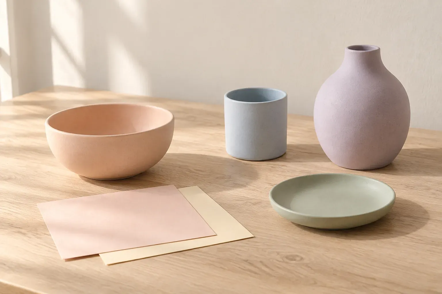
Pastel colors are pale versions of hues such as pink, blue, green and yellow, with high lightness and low-to-moderate saturation. Think blush, baby blue, mint, lilac and butter yellow. Build a useful pastel color palette by choosing a small group, varying how light or dark the colors are, and adding a deeper anchor or neutral rather than making every element equally pale.
What are pastel colors?
Pastel describes a color’s pale appearance, not a particular position on the color wheel. The encyclopedia description of pastel colors characterizes them as high-value colors with low or medium saturation in HSV. In everyday design language, that means light colors whose hue is present without the intensity of a vivid version. A pale blue and a pale peach can both be pastels even though their hues differ.
A useful paint-mixing model is a tint: a color mixed with white to make it lighter. The distinction between tints, shades and tones is that white creates a tint, black creates a shade, and gray creates a tone. You do not need to physically mix paint to choose a pastel on a screen; the tint model simply explains the pale appearance. Adding gray alone can mute a color without making it particularly light.
There is no single hex-code boundary that turns every color into a pastel. Judge both lightness and intensity: a vivid light yellow can still look bright, while a dark dusty rose is muted but not especially pastel. Avoid treating a saturation slider as the whole definition; numerical saturation depends on the color model being used.
Pastel color names and example hex codes
These pastel color codes are original example selections, not official definitions, paint matches or brand colors. Names such as blush and lilac cover a range of possible colors. Use the code when a digital reference needs precision, and use a physical sample when the final choice is fabric, paint or paper.
- Blush pink — #F2CCD2
- A pale pink example for a supporting surface, textile or illustration detail.
- Peach — #F5D7C2
- A warm orange-pink tint to try beside ivory or a deeper brown.
- Butter yellow — #F5E9B8
- A pale yellow example that can supply a warmer highlight in a cool palette.
- Mint green — #CCE5D6
- A light green example for pairing with pale blue, peach or charcoal.
- Baby blue — #C9DFF0
- A pale blue example to compare with warmer materials and backgrounds.
- Lilac — #DFD0ED
- A light purple example that can support pink or a deeper plum anchor.
- Pale periwinkle — #D1D6EF
- A blue-purple example for a palette that sits between lilac and baby blue.
Do not assume that two suppliers mean the same thing by ‘mint.’ Record your chosen reference plus the acceptable range: perhaps a pale green with a little blue, rather than any yellow-green. That brief is more useful for materials than a name alone, and less brittle than demanding a flower or ceramic glaze exactly match a screen pixel.
How to build a pastel color palette
Begin with one pastel you want to notice first. Add one supporting hue and a neutral, then decide whether you need a dark anchor. Build a sample composition before adding more colors. A swatch row makes every choice look equally important; a room sketch, package panel or invitation reveals which colors actually occupy the largest areas.
- Choose a lead hue and write where it will appear: a background, wall, garment or large illustration shape.
- Add a supporting pastel that performs a different job, rather than collecting near-duplicates.
- Introduce an anchor such as charcoal, deep plum, brown or a darker version of the lead hue.
- Vary value as well as hue so neighboring elements do not all dissolve into one pale field.
- Test the palette in its real proportions, with the photographs, text and materials it must accompany.
For a close family of hues, explore analogous colors. If you want to stay with one hue and vary its lightness, a monochromatic color scheme provides a different organizing method. Neither approach requires every color to be pastel; the darker member can provide structure.
Three pastel palette ideas with a deeper anchor
The following sets are original exercises. Their names describe a possible direction, not a promised emotional effect. Each includes a pale base, selected pastel colors and a darker option. The dark color is a candidate for structure or text, not a contrast-certified pairing.
- Warm paper and peach
- Ivory #FAF5EB, peach #F5D7C2, blush #F2CCD2 and walnut #59453D. Try ivory as the broad base, peach as the main color and blush in small details, with walnut for outlines or typography after testing.
- Mint and blue studio
- Warm white #F7F5EF, mint #CCE5D6, baby blue #C9DFF0 and charcoal #29343B. Give mint and blue distinct areas rather than alternating them in every element.
- Lilac with a yellow detail
- Cream #F8F2E5, lilac #DFD0ED, butter yellow #F5E9B8 and deep plum #49374F. Let lilac lead and use yellow selectively so the palette has a clear center.
If a set feels too sugary for your project, replace one pastel with a material-led neutral and keep the remaining hues. The guide to neutral colors explains why two seemingly simple creams or grays can still behave differently beside the same pink.
Where pastel colors can work
Use pastels where a pale surface serves the design, not because the palette has a universal meaning. For interiors, try a pastel in textiles or a small painted sample beside the room’s existing wood and stone before committing to a broad wall. For illustration, use a deeper line or shadow color when the subject needs definition. A pastel-only drawing can be intentional, but an important edge should not disappear by accident.
For branding, compare the palette on a real label, a page with body text and a photograph-led layout. A brand mood board can make those uses visible together. Avoid assigning fixed feelings such as ‘trust’ or ‘calm’ to a pale blue; choose references that show the quality you mean, then assess the work in context.
For weddings, relate pale colors to the venue, attire and material samples rather than forcing every detail to match. The wedding color palette guide turns a swatch set into roles for linens, flowers and smaller details. On any mood board, include a darker reference or neutral background if you need the pastels to remain distinguishable.
Make text readable on pastel backgrounds
Pale backgrounds do not automatically make text readable, and white lettering is not automatically a safe choice. W3C’s WCAG 2.2 Contrast (Minimum) guidance sets Level AA minimum contrast ratios of 4.5:1 for ordinary text and 3:1 for large-scale text, subject to its specified exceptions. Large-scale text means at least 18 point, or 14 point bold; a small bold label does not qualify just because it is bold.
Measure the exact foreground and background pair you intend to publish. Start with a dark candidate on a pale surface, then check it rather than trusting the color name. Test secondary copy, links, captions and text inside buttons as well as headings. Do not round a failing ratio up to the threshold, or assume a pairing on mint also passes on lilac.
For text over an image, examine the background behind the actual letters or use an adequately opaque panel with known colors. One passing text pair does not establish accessibility for an entire interface. Keep visual distinction, readable typography and information beyond color in the wider review; the color palette is only one part of that work.
Build a pastel palette from your own references
Gather a few of your own photographs, or licensed or public-domain references with source credit. Look for material color rather than only a strongly tinted photograph. The color palette from image workflow explains how to sample a meaningful detail and then assign the extracted colors practical roles. You can retain a source swatch beside an adjusted working color to show what changed.
Canvas Perch’s image palette extraction works on uploaded images: choose Extract palette to derive colors from the image itself, with up to six separated colors and fewer for sparse images. Use the extracted set as a starting reference, then choose your lead pastel, neutral and anchor; extraction does not check text contrast or match physical materials.
Keep a short decision note next to the palette: the lead hue, the dark anchor, intended proportions and which material or text pair still needs checking. Remove alternate colors once they no longer change the direction. A useful palette is one you can apply and explain, not the longest collection of attractive pale squares.
Questions and answers
What are pastel colors?
Pastel colors are pale hues with high lightness and low-to-moderate saturation. Examples include blush pink, baby blue, mint green, lilac, peach and butter yellow; the term describes their appearance rather than one fixed hue.
Are pastel colors the same as muted colors?
No. Pastels are light and relatively subdued. Muted colors have reduced intensity but can be dark, such as a dusty burgundy or olive. A color can be both muted and pastel if it is also sufficiently pale.
What colors go well with pastels?
Try ivory, warm gray, charcoal, brown or a deeper version of the main pastel hue. Choose the pairing in the actual layout or material sample; a neutral base and dark anchor often provide more useful separation than adding another equally pale hue.
Do pastel color names have official hex codes?
The examples here are not official codes. Everyday names such as blush, mint and lilac refer to ranges of colors. Record a chosen hex value for a digital reference and obtain physical samples for paint, textiles or printing.
Can I use white text on pastel colors?
Only if the exact text–background pair meets the applicable contrast requirement. Check it: WCAG 2.2 Level AA requires at least 4.5:1 for ordinary text and 3:1 for large-scale text, with specified exceptions. Dark text is a better starting candidate on a pale background, not an automatic pass.