Short answer
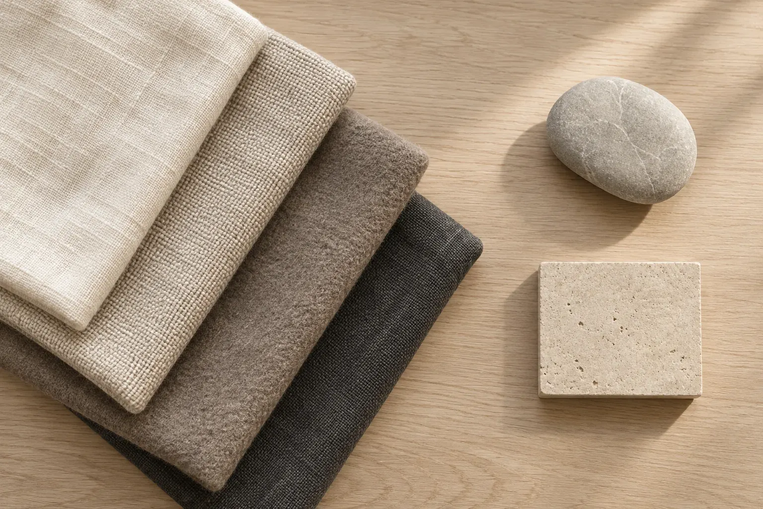
Neutral colors include white, black and gray, along with low-intensity colors used as quiet foundations, such as beige, ivory, taupe, greige and brown. They are not necessarily colorless: a cream can lean yellow and a gray can lean blue or green. Build a neutral color palette by comparing undertones, varying light and dark values, and testing the choices beside the materials or accent you plan to use.
What are neutral colors?
In a strict color sense, white, gray and black are achromatic: they have no hue. In practical decorating, fashion and branding, ‘neutral’ is a broader working category. It also includes subdued browns and pale near-whites that can act as a base rather than the main color statement. This article uses that broader design meaning, so beige and brown belong alongside gray rather than being treated as literally hue-free.
You can see this broader use in Benjamin Moore’s neutral color guidance, which includes white and gray as well as beige and deeper earthy neutrals. Its advice also emphasizes undertones and testing under different lighting conditions. These are general principles for evaluating a palette, not a recommendation for a particular paint product.
- White, ivory and cream
- White supplies the light end of a palette; ivory and cream are near-white choices whose warmer tint may become clearer beside a cooler white.
- Gray, charcoal and black
- A range from light to dark for structure. A real gray material may have a colored undertone even when it first appears plain.
- Beige and brown
- Pale to deep brown-family choices that can form a material-led base. Check the actual sample rather than assuming every beige is interchangeable.
- Taupe and greige
- Working names for brown-gray and gray-beige families. They describe a direction, not one universal formula or hex value.
A color can function as a neutral in one wardrobe or brand and as an accent in another. A muted olive coat might be a daily base for its owner, while the same olive could be the only obvious hue in an ivory-and-charcoal identity. State what role the color performs instead of arguing over a rigid list.
Warm neutrals, cool neutrals and undertones
An undertone is the subtle color bias you notice within a color that initially seems neutral. Benjamin Moore’s warm and cool color guide notes that neutrals such as white and gray can lean warm or cool. For whites, its undertone guidance identifies warm hints of red, orange or yellow and cool hints of green, blue or violet.
‘Warm gray’ and ‘cool beige’ are not contradictions. The family name tells you the broad appearance; the undertone tells you the bias within it. Temperature is also useful comparatively: one cream can look cooler than a strongly yellow cream without becoming a pure blue-gray. Judge the candidates together and beside their surroundings.
For a wider explanation of temperature relationships, see warm and cool colors. You do not need to keep an entire project on one side. An intentionally warm wood and a cool stone can work together; problems arise when you expect two different off-whites to read as the same material or color.
How to spot undertones by comparison
Compare candidates instead of viewing each alone. A single pale sample gives you little reference for deciding whether it leans pink, yellow or green. Set two or three similar-depth options next to one another, then bring in the item that cannot change: the floor, stone counter, favorite coat or existing packaging.
- Place the candidates together in the same light, keeping their size and orientation similar.
- Use a white or gray reference as a comparison point, but remember that physical reference materials may have their own tint.
- Describe what becomes visible: more yellow than the other sample, slightly pink beside the tile, or blue-gray beside the linen.
- Move the samples beside the fixed materials rather than judging them against a screen alone.
- Repeat the comparison in the lighting conditions where the final palette will be used.
Do not turn this into a search for a secret ‘true’ undertone that overrides what you see. The useful question is whether the sample behaves as intended in context. If two fabrics look pleasantly distinct, they do not need the same bias. If a wall and trim are meant to match, a persistent mismatch matters even if their names sound compatible.
For example, imagine choosing an off-white cushion beside an oatmeal sofa. The cooler candidate looks noticeably gray, while a warmer candidate sits closer to the sofa. Either is a possible choice: select the first for deliberate separation or the second for continuity. Write that intention before searching for more samples.
Neutral color palette examples with hex codes
These are original digital palette exercises, not official color names or paint and textile matches. Use the hex codes to compare a direction on a screen, then obtain appropriate physical samples if the project involves materials. Each set includes a useful spread of light, middle and dark values.
- Warm linen
- Ivory #F7F1E6, oatmeal #D8CAB8, taupe #A69588 and deep brown #4C3C33. Try ivory for the largest field, oatmeal for a supporting surface and the darker colors for selected structure.
- Cool stone
- Soft white #F3F4F1, pale gray #D3D7D8, slate gray #879399 and charcoal #2C3439. Distinguish the pale surfaces in an actual layout before relying on them for separation.
- Greige and a green accent
- Cream #F5F0E8, greige #C8BEB1, dark taupe #786A60 and muted green #617465. Let the neutral base occupy the broad areas and reserve green for a few intentional details.
If you want more visible material color, earth tones expand the range into clay, ochre, rust and plant-inspired greens. If you want a paler accent, pastel colors offer another direction. Neither requires replacing the neutral base you have already selected.
Use neutral palettes in rooms, wardrobes and brands
For a room, start with the biggest fixed surfaces, then consider walls and furniture. A palette based on the existing floor is more actionable than a beige swatch collection unrelated to the space. Place wood, fabric, stone and wall references together on an interior design mood board and note which materials are fixed, proposed or still being sampled.
Keep the room from becoming a row of same-depth beiges by changing value, texture or shape. A pale wall, middle-tone woven upholstery and dark table leg can have distinct jobs without introducing a bright accent. Do not rely on texture alone if you need a boundary to remain clear from across the room; compare a small composition of the actual elements.
Neutral palettes belong to many interior design styles. Color alone does not decide whether a room is rustic, minimal or traditional. Materials, furniture forms and arrangement matter too, so choose references that show the complete direction rather than using ‘neutral’ as a substitute for a brief.
For a wardrobe, build around the garments and shoes you already wear. Lay an outfit out as a whole: cream knit, brown trousers and a charcoal coat, for example. Decide whether leather accessories should blend or contrast. You do not need every neutral to match; you need combinations you can actually repeat with your existing pieces.
For a brand, assign separate roles to the broad background, reading color, supporting surface and accent. Test the set on a page with real copy and product images rather than only a logo. A palette being neutral does not certify readable text, and a tiny pale divider that looks clear in a swatch row may disappear in the finished composition.
Pair neutrals with one accent
Choose one accent family first and give it a specific job. In a room, that might be a blue chair with a small repeated blue detail. In a wardrobe, it might be a rust scarf. In a brand layout, it might be an accent illustration. You can vary the shade within that family without adding a second competing accent to every area.
Make a version with no accent, then add the proposed color. This shows whether it strengthens the composition or simply makes the palette longer. If the accent dominates when it should be secondary, reduce its area before choosing a new shade. The right proportions are the ones that support your particular layout, not a compulsory numerical formula.
A useful comparison exercise is to keep the warm linen palette unchanged and try muted olive, dusty blue and terracotta one at a time. Ask what you notice first and whether that is what you wanted. Keep only the selected version in the current palette, and move rejected alternatives away from the decision view.
Test neutral samples in real light
For physical materials, test the actual sample where it will be used. Observe paint samples with the nearby floor and trim, and compare fabrics under the lamps and daylight they will encounter. Benjamin Moore’s guidance recommends comparison under different lighting conditions; a photograph or tiny digital swatch is not a substitute for seeing the materials together.
- Look at the candidates in morning, afternoon and evening conditions that matter to the space.
- Check the sample beside fixed finishes, not on an unrelated wall in another room.
- Keep the finish and material in mind; a woven cloth and a glossy tile are not identical just because their base colors resemble each other.
- Record why the chosen neutral works, including any intentional warm–cool contrast.
To organize the digital side, follow the color palette from image guide. On its infinite canvas, images, notes, links and files can sit side by side. Keep reference photographs beside a note naming the material, lighting and decision. The board helps preserve the comparison; it does not turn a photographed beige into a paint specification.
A neutral palette is ready when its members have distinct roles and behave as intended in the intended setting. Keep physical samples until the decision is confirmed, record digital values where needed, and leave open questions visible. A practical palette does not have to be perfectly uniform to be coherent.
Questions and answers
What colors are considered neutral?
White, black and gray are the core achromatic neutrals. In everyday design, the category also includes beige, ivory, cream, taupe, greige and brown when they serve as a subdued base. This broader usage is about the role and appearance of the color, not an absence of hue.
What is the difference between warm and cool neutrals?
Warm neutrals show hints such as yellow, red or orange, while cool neutrals can show blue, green or violet. Compare samples of similar depth together; a gray or white name alone does not tell you how the actual material will look.
How do I find a neutral color’s undertone?
Place similar samples beside one another in the same light, then compare them with the fixed materials in your project. Note which appears more yellow, pink, blue or green relative to the others, and repeat the comparison in the final setting.
Can you mix warm and cool neutrals?
Yes. Use the difference deliberately, such as warm wood beside cool stone, and give each a distinct role. Check the actual samples together; do not expect two different off-whites to match just because both are called neutral.
How do I keep a neutral palette from looking flat?
Vary light and dark values, use contrasting material textures, and give the main surfaces different jobs. If you want visible color, introduce one accent family and test its area before adding more hues.