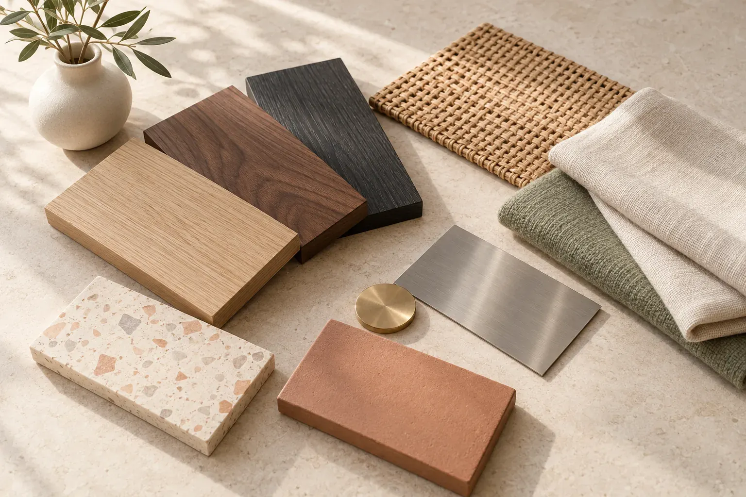
Short answer
Interior design styles are recognizable approaches to a room’s colors, materials, furniture and decorative details. Common choices include modern, traditional, Scandinavian, industrial, coastal and bohemian, but you do not need to follow one style completely. Compare actual references, note the features you like and test them against your existing room, practical needs and any restrictions before buying or changing finishes.
How to compare interior design styles without a shopping list
A room is more than its label. Two homes called minimalist can have different colors, and two people searching for farmhouse may mean very different levels of rustic detail. Look at a few consistent features: palette, material, furniture form and signature details. Then ask how to adapt those features to the room you actually have.
The descriptions below use Architectural Digest’s interior style overview as a reference for established visual cues. Palettes are suggested starting points, not compulsory colors. Rental adaptations are small editorial ideas rather than installation instructions; check your lease and get permission for changes to walls, fixtures or finishes.
Before comparing home decor styles, record what stays: the floor, the main furniture, the available light and anything you cannot alter. List the uses of the room, including storage, work, rest and movement through it. A look that only works after replacing everything is not the only possible version of that style.
For visual directions beyond rooms, explore types of aesthetics. For this comparison, focus on what would make the existing space more coherent and usable rather than what would make it resemble a staged photograph.
Modern vs contemporary: similar names, different meanings
Modern does not simply mean new, and contemporary is not one fixed historical look. Architectural Digest’s contemporary design explainer distinguishes modern’s established design references from contemporary’s changing mix of current directions. Both can use clean lines, which is why a furniture outline alone may not settle the label.
- 1. Modern
- Palette: warm neutrals, black and selected color accents. Materials: wood, glass, metal and straightforward upholstery. Furniture forms: clean geometry with little applied ornament. Signature details: visible structure and a clear relationship between form and use. Rental adaptation: simplify one existing furniture grouping and introduce a plain-lined lamp or table rather than trying to recreate an open-plan building.
- 2. Contemporary
- Palette: choose a restrained base with a current color or artwork accent. Materials: mixed wood, metal, soft fabric and woven surfaces. Furniture forms: streamlined pieces, sometimes with sculptural curves. Signature details: a mix of influences and a few clear focal points. Rental adaptation: test the direction through a portable lamp, textiles or art; avoid making every trend a permanent finish.
In practice, tell a collaborator which qualities you mean. “A simple wood table, curved seating and little visual clutter” is more useful than “make it modern.” You can like contemporary styling around an older piece without needing to relabel or replace the piece.
Mid-century modern, industrial and art deco
These styles can be easier to distinguish through silhouette and finish than through wall color. Compare the supports of a chair, the edge of a table and the shape of a light. Keep a close-up of the detail you like on the board so an atmospheric room photograph does not stand in for the actual decision.
- 7. Mid-century modern
- Palette: warm wood, cream, olive, ocher or another selected accent. Materials: wood, upholstery, leather and metal. Furniture forms: organic curves, slim legs and relatively clean profiles. Signature details: a strong outline and restrained geometric patterns. Rental adaptation: start with one portable piece that suits the scale of the room, or use an existing wood piece with a patterned cushion.
- 8. Industrial
- Palette: charcoal, rust, concrete gray and warm brown. Materials: steel, brick, weathered wood and leather. Furniture forms: straightforward frames and visibly functional construction. Signature details: exposed structure, hardware and rough-smooth contrasts. Rental adaptation: use a freestanding metal-and-wood shelf or lamp; do not strip finishes, expose wiring or install imitation infrastructure to force the look.
- 9. Art deco
- Palette: ivory, black, jewel tones and a metallic accent. Materials: polished wood, reflective metal, glass and velvet. Furniture forms: strong geometry with curved or stepped outlines. Signature details: fan motifs, decorative borders and deliberate shine. Rental adaptation: use a geometric textile, framed art or a portable lamp rather than replacing flooring or fixed lighting.
A rental with plain walls can borrow any of these through a small set of details. You do not need an original period building or a loft. Avoid selecting an uncomfortable chair solely because its outline matches the board; include dimensions, use and maintenance in the later comparison.
Farmhouse, modern farmhouse and rustic
These labels share an interest in wood and texture, but they can imply different levels of refinement. Treat modern farmhouse as a blended direction, not a separate checklist of signs and black hardware. Rustic can be a description of a material quality rather than a demand that every object look aged.
- 10. Farmhouse
- Palette: cream, warm wood, muted green and gentle pattern. Materials: solid wood, cotton, linen and ceramics. Furniture forms: sturdy tables, familiar chairs and useful storage pieces. Signature details: worn surfaces and simple domestic objects. Rental adaptation: layer a checked textile and practical pottery around an existing table; skip fixed wall treatments you cannot approve.
- 11. Modern farmhouse
- Palette: warm white, wood tones and a controlled dark accent. Materials: wood and woven fabric paired with smoother metal or glass. Furniture forms: country-influenced pieces alongside cleaner silhouettes. Signature details: rustic-refined contrast rather than decoration on every surface. Rental adaptation: pair one wood element with plain upholstery and an understated portable light; avoid rebuilding the room around a trend.
- 12. Rustic
- Palette: bark brown, stone gray, cream and muted earth colors. Materials: textured wood, stone-like surfaces, coarse fabric and pottery. Furniture forms: substantial, simple shapes with visible grain. Signature details: a rougher material character. Rental adaptation: introduce texture through a movable object or throw, not new beams, cladding or heavy stone pieces that the space cannot support.
Use earth tones to compare warm material colors without making everything brown. An existing wood floor may already supply enough texture; the useful addition could be a quieter fabric, not another distressed surface.
Traditional, transitional, bohemian and maximalist
These types of interior design styles can accommodate collected pieces, but their organizing principles differ. Traditional emphasizes familiar decorative forms, transitional blends them with cleaner contemporary choices, and bohemian allows a looser mix. Architectural Digest’s maximalism guide describes intentional layering of colors, patterns and objects—not simply filling every surface.
- 13. Traditional
- Palette: cream, warm brown, muted green, burgundy or blue. Materials: detailed wood, patterned fabrics, velvet and glass. Furniture forms: curved arms, familiar profiles and decorative legs. Signature details: framed art, patterned textiles and balanced groupings. Rental adaptation: use a pair of small lamps, a patterned cushion or a freestanding mirror with an appropriate safe support.
- 14. Transitional
- Palette: related neutrals with selective color. Materials: wood, soft upholstery and layered textures. Furniture forms: a mix of classic curves and simpler lines. Signature details: contrasts that feel connected rather than strictly matched. Rental adaptation: keep an inherited wood piece and pair it with a plain textile or clean-lined chair before considering replacements.
- 15. Bohemian
- Palette: terracotta, ocher, olive and cream, with personal accents. Materials: woven textiles, rattan, wood and collected ceramics. Furniture forms: mixed pieces with a relaxed arrangement. Signature details: layered pattern, handmade work and varied texture. Rental adaptation: use a textile and objects you already value; retain makers’ names and cultural context rather than treating everything as anonymous decoration.
- 16. Maximalist
- Palette: expressive colors connected by repetition. Materials: mixed fabrics, glossy accents, wood and collected objects. Furniture forms: varied silhouettes with some strong focal pieces. Signature details: deliberate pattern, scale and layering. Rental adaptation: experiment with existing art and patterned covers while keeping walking routes, storage access and useful surfaces clear.
Density and coherence are separate questions. A room can hold many objects while repeating a small set of colors or shapes. Conversely, a sparse room can feel unrelated when its few pieces compete. Photograph one grouping and inspect the relationship between its objects before extending the direction throughout the room.
Coastal and Mediterranean-inspired rooms
These directions can share light colors and natural surfaces without being the same. Coastal references may emphasize the colors and textures of the shore. Mediterranean-inspired references can emphasize warm clay, stone, ceramics and patterned tile. Neither label represents every home in a region; keep the specific place, maker or material attached to a reference when it matters.
- 17. Coastal
- Palette: sand, ivory, blue and weathered gray or wood tones. Materials: linen, woven fibers, wood and glass. Furniture forms: simple, comfortable silhouettes. Signature details: natural texture, restrained stripes and sea-related color. Rental adaptation: introduce a blue textile and woven surface; shells and nautical symbols are optional, not a requirement to communicate the palette.
- 18. Mediterranean-inspired
- Palette: warm white, terracotta, ocher, olive and selected blue. Materials: clay, linen, wood and textured stone-like surfaces. Furniture forms: substantial simple pieces, sometimes with curved outlines. Signature details: ceramics and patterned tile references. Rental adaptation: use a ceramic vessel or patterned textile to suggest the direction, rather than altering arches, walls or flooring.
A neutral color palette can support either approach, but it is not enough to distinguish them. Compare the material texture and the shape of the furniture as well as the swatches. Test actual samples in the room rather than assuming a screen image is an exact finish match.
How to find your interior design style with a mood board
Begin with the room, not a quiz result. Take photographs of what stays and collect a modest set of references you like. Beside each, name the feature: woven texture, a slim chair leg, low color contrast or a curved lamp. Keep the source of other people’s photographs and check permission before publishing the board. Your notes should explain your selection even after you forget the original caption.
- Record constraints: measurements, fixed finishes, uses of the room, items to keep and rental permissions.
- Collect close-ups as well as whole rooms, so you can identify a material or shape without copying an entire scene.
- Group references by repeated qualities and write a plain-language direction before assigning a style label.
- Make a small shortlist: a few colors, a couple of material relationships and one or two furniture qualities.
- Test with existing objects or real samples, then separate confirmed choices from ideas that still need checking.
The interior design mood board guide explains how to keep inspiration distinct from finishes and purchasing decisions. The moodboards use case shows the broader collection-and-comparison approach.
Canvas Perch’s infinite canvas can keep images, notes, links and files side by side, with checklists nearby. The Quiet spaces starter template contains sample content, not a real room project; use it as a starting arrangement and replace the examples with your own references and constraints.
Your final description might be “simple wood furniture, soft texture and muted green,” even if the references span Scandinavian, contemporary and coastal rooms. That description can guide a decision more reliably than forcing the collection into one category.
How to mix two interior styles without losing the thread
Choose what each style contributes. One can guide the larger furniture forms while the other guides textiles or decorative detail. This is a design heuristic, not a required percentage formula. Keep a shared quality visible—wood tone, repeated curve, related colors or a similar level of contrast—so the mix has a reason.
In a fictional rental, an inherited traditional wood table could sit with clean-lined contemporary chairs. The connection might be warm wood and plain upholstery, with a patterned runner as the single decorative detail. In another invented example, industrial shelving could sit beside coastal linen and a blue textile; the shared thread is a restrained palette, while soft fabric balances the harder frame. Neither requires changing the building.
- Name the job of each style rather than adding its most recognizable symbol everywhere.
- Repeat a connecting material or color across the room instead of grouping each style into a separate unrelated corner.
- Compare scale and use: a beautiful reference still needs to fit, support the intended activity and allow access.
- Keep uncertain choices off the purchasing list until you have tested the combination with the fixed room elements.
Stop when the room supports its uses and the choices feel connected. A coherent home does not need to look like a showroom, and a changed preference does not require replacing sound furniture. Style vocabulary is there to help you describe choices, not to make ordinary belongings seem wrong.
Questions and answers
What are the main interior design styles?
Common names include modern, contemporary, minimalist, Scandinavian, Japandi, mid-century modern, industrial, farmhouse, traditional, transitional, bohemian, coastal, Mediterranean-inspired, art deco and maximalist. Their features overlap, so compare materials and forms rather than treating the labels as exclusive categories.
How do I find my interior design style?
Collect references beside photographs of your real room, identify recurring colors, textures and furniture shapes, and test a small combination. A plain-language description of what you like is more useful than a quiz label alone.
What is the difference between modern and contemporary design?
Modern refers to established design influences and recognizable principles, while contemporary describes an evolving mix of current directions. Both may use clean lines, but contemporary is not one fixed historical look.
Can I mix two interior design styles?
Yes. Give each style a clear role and repeat a connecting color, material or shape. Check the combined references against the room’s fixed finishes, furniture scale and practical uses.
How can I change my decor style in a rental?
Begin with portable choices such as textiles, lamps, artwork and freestanding furniture. Check the lease and obtain permission before changing fixed finishes or fittings; a style does not require structural alterations.