Short answer
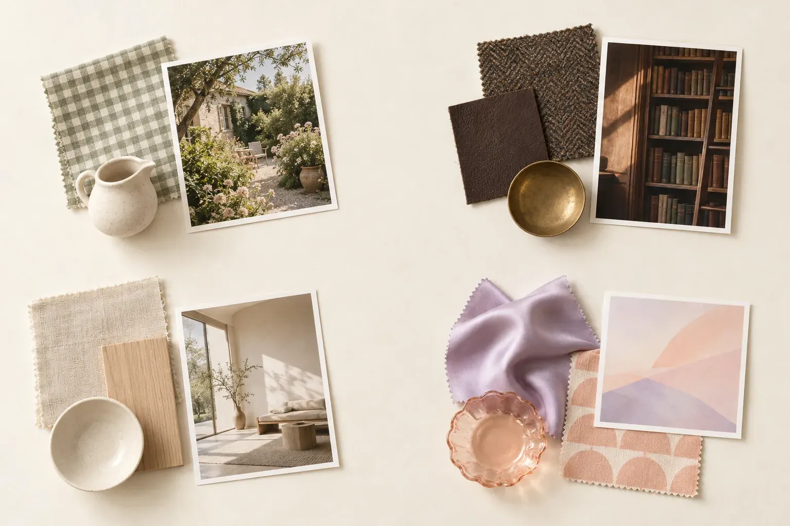
Types of aesthetics are named visual directions, such as cottagecore, dark academia, minimalism, Y2K and coastal. Online, an aesthetic usually groups recurring colors, textures, objects and settings into a recognizable look. Use the names as search vocabulary, not personality categories: compare actual references, identify what you like and test a few choices before adopting an entire style.
What do types of aesthetics describe?
In this guide, an aesthetic means a visual language you can recognize across images: the light, palette, surfaces, shapes and motifs that make a collection feel related. That is a narrower use than aesthetics as a field of philosophy. A style label can help you find references, but it does not tell you a person’s values, identity, gender, budget or way of life.
There is no single complete list of aesthetic types. Internet labels sit beside established design styles, broad visual approaches and small variations. Their boundaries overlap. A brown library photograph could fit dark academia, traditional interiors or a personal board called “quiet study.” What matters is naming the qualities you are actually using.
For the underlying tool, see what a mood board is. The 22 entries below are practical reference recipes: suggested palettes and subjects, not mandatory rules or an official taxonomy. The interior design styles guide translates room-focused labels into furniture and rental-friendly choices.
“Core aesthetics” is a useful search phrase for names such as cottagecore and goblincore. It does not mean every aesthetic must end in “core,” or that adding the suffix creates a distinct historical movement. Avoid assigning a precise origin or date to a fluid online label unless your project genuinely needs that history and you have a reliable source.
Nature-led aesthetics: cottagecore, goblincore, botanical and coastal
Nature-led boards can differ sharply in texture and setting. The BBC’s cottagecore feature describes rural imagery, crafts, gingham and gardens; the Guardian’s goblincore reporting emphasizes moss, fungi and the less polished side of nature. Neither look requires you to live in a particular place.
- 1. Cottagecore
- Try cream, sage, faded rose and warm brown. Pair cotton or linen with wicker, floral prints and handmade ceramics; choose gingham, embroidery or worn wood textures. Garden paths, a cottage kitchen, a picnic or a sewing table make useful settings. Keep the details specific rather than treating rural life as an effortless fantasy.
- 2. Goblincore
- Try moss green, soil brown, ocher and muted gray. Look for bark, pebbles, coarse knits and irregular natural textures; mushrooms, snails and fern shapes can form motifs. Damp woodland and a close-up of the forest floor provide a different emphasis from a tidy flower garden. Photograph nature without removing protected objects or disturbing habitats.
- 3. Botanical
- For a plant-centered direction, try leaf green, ivory and terracotta. Combine paper, glass and natural fibers with leaf veins, plant silhouettes or botanical drawings. A greenhouse, windowsill or potting bench supplies a setting. This is a broad descriptive board label, not a claim that all plant imagery belongs to one subculture.
- 4. Coastal
- Try sand, ivory, sea blue and weathered gray. Use linen, woven fibers, wood and glass; emphasize ripples, stripes or dune-grass shapes. A shore path or an airy room can set the scene. Decide whether you want muted coastal textures or a more literal nautical direction before adding anchors and shells.
For a restrained nature-led palette, compare earth tones with your actual photographs. A color name alone does not explain whether you prefer dry clay, dark soil or a pale sandy surface.
Scholarly and romantic aesthetics
The scholarly recipes below share books and architectural references but change their light and contrast. Britannica’s dark academia overview connects that online aesthetic with reading, writing, classic books and dark tweeds. The BBC’s coquette feature discusses bows, lace, pearls and pale colors. These are visual cues, not eligibility requirements for the people using them.
- 5. Dark academia
- Try espresso, charcoal, olive and burgundy. Build texture with tweed, dark wood, leather and aged paper; use books, arches and desk lamps as motifs. A dim library or an old study offers a setting. Keep readable notes and usable light in a real project instead of imitating darkness at the expense of function.
- 6. Light academia
- For a lighter scholarly board, try ivory, oatmeal, tan and soft gold. Choose linen, pale paper and warm wood; repeat notebooks, columns or simple book stacks. Sunlit study rooms and open courtyards distinguish this recipe from the darker board. Compare the same subject in different light to see which quality you prefer.
- 7. Coquette
- Try blush, ivory, lilac and a small dark accent. Satin, lace, ribbon and pearl-like details supply sheen and delicate texture; bows and scalloped edges can repeat. A dressing table, textile close-up or carefully styled shelf can provide the setting. Do not turn a visual preference into a body, age or gender standard.
- 8. Romantic
- For a broader romantic direction, try dusty rose, plum and cream. Use velvet, softly worn wood and patterned fabric; gather florals, curved frames and draped shapes. A flower-filled room or an evening table can anchor the board. State which qualities you mean, since “romantic” alone leaves many interpretations open.
Retro, digital and rough-textured aesthetics
These recipes use contrast, shine or visible wear rather than one shared room style. Architectural Digest’s Y2K guide describes bright colors, chrome, icy blue and retrofuturist details. The specific combinations below are suggestions for your own board, not claims about when each label began.
- 9. Y2K
- Try icy blue, silver, hot pink or lime, choosing a few rather than all at once. Glossy plastic, chrome and translucent surfaces supply materials; bubble shapes and shiny accessories can form motifs. A playful room or product still life works as a setting. Separate the reflective surfaces you like from branded nostalgia you do not need.
- 10. Vaporwave
- For a vaporwave-inspired visual experiment, try pink, cyan and violet. Combine glossy surfaces with deliberately synthetic gradients, grid patterns, sculptural forms and empty commercial spaces. A fictional mall-like corridor or abstract digital collage can set the scene. Treat this as a stylized art direction, not a palette that must be copied into everyday interiors.
- 11. Grunge
- Try faded black, muted red and denim blue. Combine denim, flannel-like checks, scuffed leather and torn-paper texture; rough edges and layered prints supply motifs. An informal room, rehearsal space or weathered wall can frame the references. You can borrow wear and contrast without inventing a lifestyle or attitude for the person using them.
- 12. Retrofuturist
- Try silver, warm orange and cream, or a different tightly chosen contrast. Smooth metal, translucent pieces and molded curves create material interest; capsule shapes and rounded geometric forms can repeat. Build a fictional future-facing room or object collection. Label the particular references you are using instead of assigning one historical era to the whole board.
Quiet and material-led aesthetics
For the room-related vocabulary, Architectural Digest’s style overview distinguishes Scandinavian materials, minimalist editing and other design directions. Its Japandi explainer describes a blend of Japanese and Scandinavian influences and distinguishes that blend from wabi-sabi. Do not reduce complex traditions to a beige shopping list.
- 13. Minimalism
- Try ivory, charcoal and one chosen accent, or use a different restricted palette. Smooth surfaces, simple geometry and generous empty space matter more than making everything white. A clear tabletop or edited room provides a setting. Keep useful and meaningful objects; removal for its own sake is not the goal of the board.
- 14. Scandinavian
- Try pale wood tones, cream, gray and a soft accent. Wood, wool, linen and simple ceramics offer tactile variety; clean forms and restrained patterns can repeat. A light-filled living space or practical work corner makes a useful reference. Describe the actual material and function instead of making claims about how an entire region lives.
- 15. Japandi
- Try oatmeal, brown, muted green and charcoal. Combine pale and dark wood, paper, linen and stone-like surfaces with clean silhouettes and restrained organic forms. A spare room or a carefully arranged shelf offers a setting. Compare light and dark material samples; the visual blend need not erase their differences.
- 16. Wabi-sabi-inspired
- For a material study, try clay, ash, warm gray and weathered brown. Choose handmade ceramics, uneven grain and softened fabric; let patina and irregularity supply texture. A quiet still life can be enough. This recipe borrows visual qualities associated with imperfection and age, not a complete explanation of the philosophy.
- 17. Monochrome
- Choose one hue or a black-and-white range, then vary lightness and texture. Paper, fabric and ceramic can sit together when their tones relate; repeating outlines or geometric shapes can supply motifs. Use any setting that suits the project. Monochrome describes a color approach and can be combined with several other aesthetics.
Layered and structure-led aesthetics
A dense board can still have a clear direction. Architectural Digest’s maximalism guide describes deliberate layering of color, pattern and objects rather than indiscriminate clutter. For these recipes, keep track of the detail that connects your references: an outline, a finish or a repeated color.
- 18. Maximalism
- Try jewel colors, warm pink or another expressive combination. Mix patterned textiles, glossy accents and collected objects; use florals, checks or geometric motifs in different scales. A layered room or a densely arranged shelf can anchor the board. Editing still matters: each piece should contribute something rather than simply occupy space.
- 19. Boho
- Try clay, ocher, olive and warm cream, with brighter accents if you want them. Rattan, woven fabrics and wood create texture; fringes and mixed patterns can repeat. A relaxed living space or textile collection offers a setting. Identify makers and sources rather than treating culturally specific work as anonymous decoration.
- 20. Art deco
- Try deep green, black, ivory and a metallic accent. Polished wood, reflective metal and velvet bring material contrast; fans, stepped shapes and geometric borders offer motifs. A dramatic room, doorway or lamp can provide a setting. Borrow a few strong details instead of assuming that every shiny object communicates the style.
- 21. Mid-century modern
- Try walnut brown, cream, olive or ocher. Pair wood and upholstery with slim supports, organic curves and simple geometry. A living room, sideboard or furniture detail can anchor the board. Compare silhouette and proportion, not only color, when deciding which reference belongs.
- 22. Industrial
- Try charcoal, rust, warm brown and concrete gray. Steel, brick, weathered wood and leather supply contrasting textures; exposed structure and straightforward hardware can recur. A loft-like room or workshop detail provides a setting. Translate the material contrast rather than assuming you need to expose pipes or alter a building.
How to find your own aesthetic with a mood board
Start with references you genuinely like before you search for a label. Include your own photographs of places, clothes and objects you return to. Keep a source link with other people’s work, use licensed or public-domain references where appropriate and check permission before publishing the collection. An unlabeled folder is difficult to interpret later.
- Collect: gather a manageable set for one purpose, such as a room corner, an outfit or a photo series. Include real constraints and items you already own.
- Cluster: group by visible similarities—light, contrast, texture, shape or density. Do not sort only by the hashtag attached to the original image.
- Name: write a few descriptive words for each group, such as “pale wood, soft fabric, little pattern.” Add an aesthetic label only if it helps you find closer references.
- Test: try one small choice in the actual setting. Compare a fabric sample, an outfit from existing clothes or a simple photograph before committing to a full direction.
Use mood board examples to compare how a direction becomes a collection, and a fashion mood board when silhouette and fabric are the central decisions. The pastel colors guide can help with a soft palette; it cannot decide whether lace, wood or translucent plastic expresses the direction you want.
Canvas Perch’s infinite canvas places images, notes, links and files side by side. You can keep a source and your reason for choosing a reference nearby; canvas themes offers focused collection prompts around light, materials, color and place, rather than deciding your personal aesthetic for you.
How to avoid chasing every new aesthetic
A useful direction survives a change of label. Ask what remains attractive when you remove the trend name: the grain of the wood, the low contrast, the bow shape or the use of space. Keep those qualities in a short note. You can combine them without purchasing every object used in someone else’s example.
Separate a reference you enjoy looking at from a choice you want to live with. A dramatic library image may be wonderful for a story but inconvenient for your desk. A shiny pastel still life might work in a photograph but not suit your wardrobe. The test is fit for the actual project, not loyalty to a category.
Do not infer someone’s identity from a palette or demand that they match a stereotype to use a style. Preserve cultural context when borrowing specific designs. Your board can have two related clusters and one plain-language description; it does not need a newly invented “core” name or a replacement every time your feed changes.
Questions and answers
How many types of aesthetics are there?
There is no fixed total or official online taxonomy. This guide offers 22 useful visual directions; labels overlap, and new variations do not necessarily represent separate design movements.
What are core aesthetics?
The phrase usually points to named online looks such as cottagecore and goblincore. The suffix is search vocabulary, not a rule that every visual style follows or proof of a shared origin.
How do I find my aesthetic?
Collect references for one real purpose, cluster them by visible qualities and describe what repeats. Test one small choice before adopting a label or buying a whole collection.
Can I have more than one aesthetic?
Yes. Different projects can need different directions, and one board can combine styles through a repeated material, shape or palette. Use a clear connecting quality instead of adding unrelated references without explanation.
What is the difference between an aesthetic and an interior design style?
An online aesthetic can describe images, clothing, objects or settings broadly. An interior design style is more specifically concerned with rooms, furniture and finishes. Some names, such as coastal or industrial, are used in both contexts.