Short answer
Earth tones are colors associated with natural materials, especially brown, tan, sand, clay, ochre and rust. For a broader nature-inspired palette, you can add olive, moss green or slate. Build an earth tone color palette from a few related material references, give the colors distinct light and dark roles, and add a neutral or contrasting accent where the design needs separation.
What are earth tones?
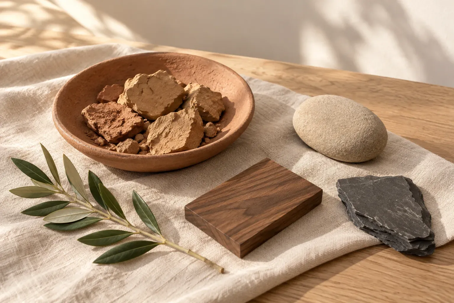
The core of the term is a subdued brown-and-neutral range. Dictionary.com’s earth tone definition describes warm, muted colors running from neutral to deep brown. For the practical palettes in this article, we also use natural materials as inspiration: clay, wood, stone and foliage. That broader approach lets you introduce an olive or slate without claiming that every color found outdoors is an earth tone.
Start by naming the material relationship you want. A palette based on dry clay and sand will differ from one based on dark wood and leaves. ‘Earthy’ is more useful when it points to a reference you can see than when it becomes a catch-all for every muted color. You do not need a definitive master list to build a coherent set.
An earthy palette also does not have to be entirely brown or entirely warm. A cool gray stone can support a warmer terracotta, and a plant-inspired green can contrast with rust. The question is whether each color belongs to the material story you chose and performs a useful job in the finished room, outfit or layout.
Earth tone color names and example codes
These earth tone colors and hex values are our own example selections. They are not official definitions, paint formulas or standards for natural materials. Real clay, stone, wood and leaves vary; a name such as moss or sand tells someone the direction, while the sample shows the specific choice.
- Sand — #D8C5A6
- A pale beige example for a broad base or a lighter supporting area.
- Tan — #B99872
- A middle-light brown example to bridge cream and deeper wood colors.
- Terracotta — #B96F52
- A muted orange-brown example inspired by clay, useful as a lead color or accent.
- Ochre — #B28A38
- A yellow-brown example for a warmer detail alongside brown or olive.
- Rust — #97503D
- A deeper red-brown example to compare with sand, cream and plant-inspired greens.
- Walnut brown — #594332
- A dark brown anchor candidate for furniture references, outlines or type after testing.
- Olive — #74764B
- A muted yellow-green addition for a foliage-led direction.
- Moss — #59694B
- A deeper green addition to try beside wood, sand or a warm clay color.
- Slate — #59646B
- A cool blue-gray addition for contrast with warmer material colors.
Treat these names as a starting vocabulary. If you are briefing someone, add the reference and a qualifier such as ‘more brown than orange’ or ‘a gray-green rather than a bright leaf green.’ That prevents two people from approving the same word while imagining different colors.
Three earth tone color palette ideas
The following original sets include a light base, supporting material colors and a darker anchor. They are exercises to adapt, not ready-made material specifications. The hex values describe digital examples; obtain samples for interiors, fabric and print, and check exact foreground–background pairs when the colors will carry text.
- Clay workshop
- Cream #F4EBDD, sand #D8C5A6, terracotta #B96F52 and walnut #594332. Try cream and sand across broad areas, terracotta as the distinctive material color and walnut for selected structure.
- Woodland materials
- Linen #EFEADD, tan #B99872, moss #59694B and bark brown #453A30. Give green one main use, such as upholstery or an illustration shape, rather than scattering it equally through every element.
- Stone with rust
- Warm white #F2EEE7, pale stone #C9C2B6, slate #59646B and rust #97503D. Use the warmer rust as a smaller contrast within the gray-led set, then adjust its area in the actual composition.
If you need a quieter version, reduce the clay or green area and let neutral colors lead. If the set is too uniform, compare a warmer and a cooler member using the warm and cool colors guide. Do not add a new hue until you know which role is missing.
Use earth tones in interiors
Begin with what the room already contains. Note the floor, major wood furniture, stone surfaces and large textiles before choosing wall colors. A dark walnut table and pale stone tile are not background trivia: their size and placement can shape the palette more than a small decorative object. Include those fixed materials in the first comparison.
Build an interior design mood board with a view of the room, close material references and a simple proposed palette. Mark what is staying, what is being considered and what needs a sample. Avoid a board containing only beautiful close-ups; it should also show how the colors will coexist at room scale.
For a fictional living-room exercise, keep an existing brown floor, use a pale linen sofa and test muted clay cushions with a dark green chair. Make one version without the green chair to see what it contributes. If the clay already provides enough contrast, the extra hue may be unnecessary. If the room lacks a focal point, the green can have that specific job.
Test proposed paint and fabric samples in the actual space with its daylight and lamps before committing. Photographing the samples can document the comparison, but do not use the image as proof of an exact match. Keep the physical samples and note which combination you preferred in the conditions that matter to the room.
Use earth tones in fashion and branding
For fashion, choose a practical base before adding accents. Brown trousers, a cream shirt and an olive layer form one possible outfit exercise. Add a rust accessory only if it contributes something you want to repeat. Lay the actual garments together, including shoes and bags; a palette that works as digital squares may describe items you do not own or would not wear together.
A fashion mood board should show silhouette, texture and outfit combinations alongside color. Record whether a reference contributes its corduroy texture, its brown–cream relationship or the complete styling. This makes it easier to reuse the idea without copying the entire outfit or shopping for every object in a photograph.
For a brand, give the colors jobs: a pale packaging field, a dark reading color, a clay-colored graphic and perhaps a green detail. Try the palette on a complete label or page with actual text and photography. Do not assume a medium brown or olive is dark enough for body copy just because it looks substantial beside cream; the exact pairing still needs contrast testing.
Earth tones do not establish that a product is natural, sustainable or handmade. Those are separate claims that need their own evidence. If you are comparing a rustic, woodland or material-led visual direction, use the types of aesthetics guide to keep the broader style description separate from what the business actually makes or promises.
Pair earth tones with neutrals and a contrasting accent
A neutral can provide room for a more distinctive earth color. Try warm white around terracotta, cream beside olive or a pale gray beside rust. Then choose an anchor for structure: a deep brown, charcoal or dark green. You do not need all three. Select one that belongs to the intended materials and compare it in the finished composition.
If the palette feels monotonous, diagnose the problem before adding color. Similar lightness may be the issue, in which case a darker brown can help more than another hue. If the values already differ but you want a sharper color contrast, try a small slate-blue element beside warm clay. Treat it as an added accent, not as a requirement for every earthy set.
- Keep the broad base stable while testing one accent at a time.
- Change the accent’s area before replacing its color; a smaller dose may be enough.
- View a version without the accent to identify what it actually contributes.
- Repeat the selected accent only where the composition needs a connection.
There is no requirement to keep everything muted. A clearer accent can be intentional, but the palette should not lose its main material relationship. If the accent becomes the first thing you notice everywhere, decide whether you still want an earth-led design or a brighter design supported by earth colors.
Build an earth tone palette from natural-material photos
Choose your own photographs or licensed or public-domain images with credit. A close-up of clay, a wood grain study or a stone-and-leaf arrangement can give you a concrete starting point. Follow the color palette from image workflow to sample or extract candidate colors, then edit them into a small group with distinct roles. Choose a material’s useful middle color rather than copying every highlight and shadow.
- Select a reference that shows the materials you want, not just an attractive color filter.
- Identify a light base, a main material hue, a darker anchor and an optional accent.
- Remove almost identical swatches that perform the same job.
- Keep the source photograph next to the working palette and describe each selected region.
- Make a small room, outfit or layout test before declaring the palette finished.
Canvas Perch’s image palette extraction uses uploaded images: choose Extract palette to derive up to six separated colors from the image itself, with fewer from sparse images. Selecting more than one image extracts a combined palette. This can help compare wood, clay and plant references together; it does not identify a wood species, match a paint or verify material color accuracy.
Keep the digital example and physical specification separate. A code can document the palette direction, while a fabric swatch, stone sample or approved proof establishes the actual material choice. The board is most useful when it shows both what inspired the color and what has genuinely been selected.
Questions and answers
What are earth tones?
Earth tones center on muted natural-looking browns and neutrals such as tan, sand, clay, ochre and rust. For a broader nature-inspired palette, you can also use foliage greens and stone grays; state the material reference rather than treating every outdoor color as an earth tone.
Is green an earth tone?
Muted olive or moss can be useful additions to a broader nature-inspired earth palette, especially with wood and soil colors. That does not mean every green belongs: a bright neon green has a different appearance and would usually function as a contrasting accent.
Are earth tones always warm colors?
The core brown, clay and ochre range often leans warm. An earth-inspired palette can also include cooler stone grays or greens. Choose the mix from the materials and effect you intend, rather than forcing every member into the same temperature category.
What colors pair well with earth tones?
Try cream, ivory, pale gray or charcoal as a base or anchor. For an extra color contrast, test a small slate-blue accent beside clay or rust, or a muted green beside brown. Check the actual materials and proportions before keeping the combination.
How do I create an earth tone color palette from a photo?
Choose a material-led photograph, extract or sample candidate colors, and select a light base, main hue, dark anchor and optional accent. Remove duplicate swatches and test the set in its intended layout. Photograph colors are references, not exact paint or textile specifications.