Short answer
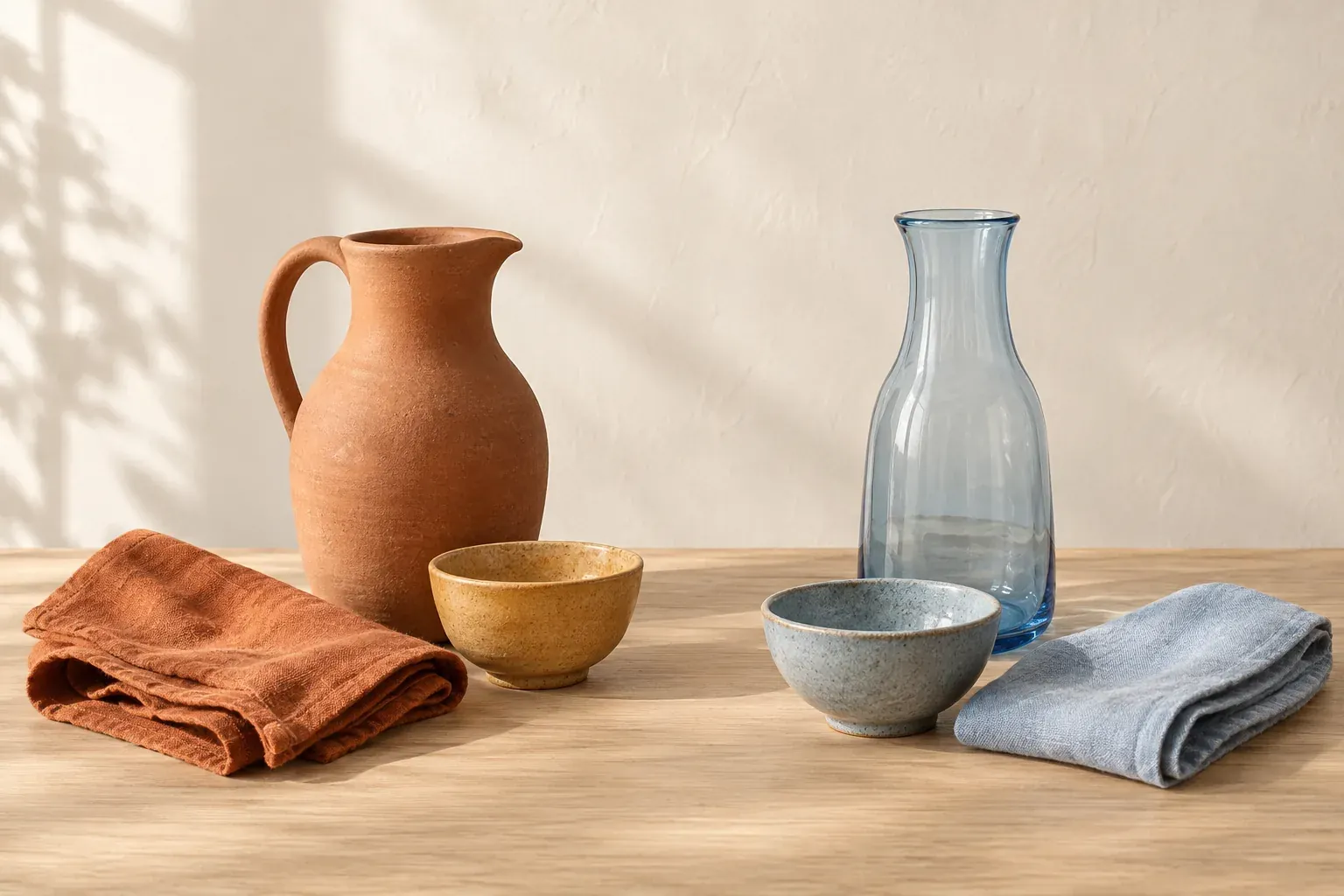
Warm colors usually include reds, oranges and yellows; cool colors usually include blues, greens and violets. This is a common art and design division, not a measurement of physical heat. Temperature is also relative: one blue can look warmer than another, and a red can lean cooler than a neighboring red. Compare actual samples, their surroundings and the light before choosing a palette.
What are warm colors and cool colors?
The usual color-wheel split puts red, orange and yellow on the warm side and green, blue and violet on the cool side. Adobe’s color-wheel guide uses this familiar division. It is a starting vocabulary for describing an image or a material sample, not an absolute rule that tells you how every viewer will feel.
- Warm family
- Red, red-orange, orange, yellow-orange and yellow are common examples. Rust, terracotta and ochre are useful muted directions when bright orange or yellow would be too strong for the project.
- Cool family
- Blue, blue-green, green and violet are common examples. Slate blue, teal and muted violet offer less saturated directions than a vivid blue or purple.
- Relative temperature
- A comparison between colors. A hue can belong to the generally cool family while looking warmer than another version of that hue.
Colors near the boundaries need context. A yellow-green and a blue-green are both green, but they are not interchangeable. A red-violet and a blue-violet tell different stories beside the same orange. Rather than arguing over which half owns a borderline swatch, put the actual candidates together and describe which one leans warmer in that arrangement.
How can a blue be warm or a red be cool?
Winsor & Newton’s guide to warm and cool colors explains why it does not supply a definitive temperature chart for every paint: color bias depends on comparison. It gives an example in which an ultramarine green shade looks warmer beside cerulean blue. The useful question is “warmer than which color?” rather than “is blue secretly a warm color?”
Artists & Illustrators’ discussion of blue temperature compares a greener cerulean with an ultramarine leaning toward mauve. In that painting convention, the latter is the warmer blue. For reds, compare an orange-leaning red with a violet-leaning red; the violet-leaning choice is often described as cooler. These are relational descriptions, not a universal ranking of all pigments.
Make a two-swatch comparison, then add the surrounding colors from the project. Write “warmer blue beside this teal” or “cooler red beside this orange” in the notes. This is especially helpful when reviewing a palette with someone else: a plain label such as “warm blue” can hide different assumptions about the comparison or the wheel being used.
Find undertones in paint, fabric and neutrals
In its paint undertone guide, Sherwin-Williams distinguishes the overall color from the subtle hue that separates it from similar colors. It recommends comparison rather than judging a sample alone. A white can appear plain until you put it beside another white; then a yellow, pink, green or blue bias becomes easier to discuss.
For a fabric comparison, place the samples in the way you will use them: the lining against the outer fabric, the cushion against the upholstery or the shirt under the jacket. Treat “undertone” as a description of the visible hue bias, not a claim about a hidden ingredient. If two grays fight your intended direction, name the difference before replacing both: one may lean blue while the other leans brown.
- Compare several samples within the same family, not one isolated chip.
- Put them beside materials that must stay, such as timber, stone or an existing garment.
- Look at the large surface and the small detail separately.
- Record the comparison and lighting condition rather than only “warm” or “cool.”
Use neutral colors when you need quieter support, but still compare their biases. A neutral name does not mean the sample has no visible hue. The same practical checks apply to muted earth tones.
Use color temperature in art as a depth convention
Warm-advance and cool-recede is a widely taught painting convention: warmer passages are used to suggest nearer areas and cooler passages to suggest distance. The Artists & Illustrators explanation explicitly describes it as something painters are taught. Use it as a compositional tool, not a law that overrides your observation of the subject.
For an original practice study, paint the same arrangement twice: a small bowl in front of a folded cloth. In the first, give the bowl a warmer direction and the cloth a cooler one. In the second, reverse them while keeping the drawing similar. Compare the result. You are investigating a relationship within a composition, not proving that all warm objects always appear nearer.
If the reference has a cool foreground and a warm background, paint what you see before correcting it to fit the convention. Overlap, edge choices and the light–dark arrangement are also available to you. Write down where the temperature contrast helps and where you need a different cue. A useful exercise leaves you with more choices, not a rule that makes every landscape look alike.
Separate palette temperature from light temperature
A warm-colored wall and a warm-white bulb are different things. The US Department of Energy’s LED color characteristics factsheet explains correlated color temperature, or CCT, as a description of nominally white light’s appearance. It is expressed in kelvin, using a reference to a theoretical heated black body. It does not describe the bulb’s operating heat or the temperature of the room.
Lower-CCT white light looks more yellowish or warm; higher-CCT white light looks more bluish or cool. Notice the reversal in everyday wording: a higher number does not mean a warmer-looking bulb. The factsheet also distinguishes the appearance of the light itself from how that light renders the colors of objects. Two sources with the same CCT can render a material differently.
Do not assume a bulb labeled “daylight” reproduces every daylight condition. Compare your samples near the window at different times and under the lamps you actually intend to use. Keep daylight and evening observations separate. If a linen looks blue-gray by the window and much duller under a warm bulb, that difference belongs in the decision, not in a footnote after the room is finished.
Choose warm and cool colors for an interior
Start with the surfaces you are not changing. A warm timber floor and a cool stone worktop may already establish a mixed direction. You do not have to make every new object match one temperature. Choose which relationship should lead, and use the other family deliberately rather than introducing it accidentally through a sample you viewed under different light.
For a fictional reading corner, try warm ivory walls and a rust textile with one muted blue chair. For a different direction, try blue-gray upholstery, cool pale walls and a small terracotta lamp base. Neither is inherently the correct or more comfortable palette. Compare the actual room, the amount of each material and the lighting before deciding which direction expresses your intention.
- Gather the fixed materials and photograph their relationship for reference.
- Select one warm-led option and one cool-led option.
- Place physical paint and fabric samples where they will be used.
- Review the same samples in daylight and with the evening lamps on.
- Remove options that fail beside the fixed materials before buying larger quantities.
An interior design mood board keeps these material comparisons together. Use it to narrow the choice, then return to the real room; an attractive screen arrangement is not an exact physical color match.
Build a brand or mood board without universal mood claims
You might associate orange with warmth, blue with water or terracotta with a sunlit building. Those are useful associations to name in a creative brief, not scientific guarantees about emotions or behavior. Say “we want this palette to reference baked clay and late-afternoon light” rather than “orange will make everyone feel welcome.” The first statement gives the images a shared direction without claiming an effect you cannot promise.
Create two small boards with the same typography, shapes and subject matter: one warm-led, one cool-led. Keep the amount of saturated color comparable so you are not comparing a vivid orange board with an almost gray blue one. Ask which board fits the particular audience, story and use. If both fail, the issue may be imagery or composition rather than temperature.
Neighboring hues can keep either direction focused. The analogous colors guide shows how to select related hues while assigning distinct jobs. If a photograph carries the direction you want, use color palette from an image to make a starting set, then edit it for the actual design.
Canvas Perch’s image palettes work with uploaded images and select up to six separated colors. Keep a comparison note beside the source image rather than assuming extraction labels the result warm or cool. Palette extraction supplies reference colors, not a finished brand direction.
Check the palette’s job before choosing a temperature
Temperature is one decision among several. A cool-led palette can still need a dark anchor; a warm-led palette can still need a pale background. Before keeping a swatch, ask what it does: define a large surface, connect materials, separate a shape or draw attention. If you cannot give it a job, it may be another attractive option rather than part of the working palette.
For text, hue temperature does not replace a contrast check. WCAG 2.2’s Contrast (Minimum) guidance requires at least 4.5:1 for ordinary text and 3:1 for large-scale text at Level AA, with specified exceptions. Large-scale means at least 18 point, or 14 point bold. Test the actual foreground and background values instead of assuming a warm–cool pairing is readable.
Keep the chosen colors, physical sample notes and the relevant light conditions together. “Cool blue accent beside rust linen; checked at the window and under the planned lamp” is a decision another person can understand. “A calming palette” is only an intention. The useful result is a small set of colors whose relationships still work where you will use them.
Questions and answers
What are warm colors and cool colors?
Warm colors usually include reds, oranges and yellows; cool colors usually include blues, greens and violets. This common wheel division is a design convention, while relative temperature describes how one sample compares with another.
Can blue be a warm color?
A blue can be warmer than another blue while still belonging to the broadly cool family. In a common painting comparison, a violet-leaning ultramarine is described as warmer than a greener cerulean; the surrounding colors also matter.
Is gray a warm or cool color?
Compare the specific gray with other grays and nearby materials. A visible yellow or brown bias may read warm, while a blue bias may read cool. “Gray” alone does not give enough information to classify a paint or fabric sample.
Can you mix warm and cool colors in a room?
Yes. Choose which family leads, then make the other a deliberate support or accent. Compare samples beside the fixed materials and under both daylight and the planned artificial light before committing.
Does a higher kelvin number mean warmer light?
No. Higher correlated color temperatures generally describe cooler, more bluish white light; lower values describe warmer, more yellowish white light. CCT describes appearance, not the bulb’s operating heat or the room temperature.
Do warm colors always come forward in a painting?
No. Warm-advance and cool-recede is a widely taught convention, not an absolute law. Try it as a compositional exercise, but keep the observed subject and other depth cues in view.