Short answer
Choose a wedding color palette by starting with your venue, season, lighting and details already fixed, such as attire or existing decor. Select three to five colors as a manageable starting point, give each a role, and test them with fabric and flower references. Record the chosen direction and acceptable variations on a shared board so vendors can interpret the palette rather than guess from color names alone.
How to choose a wedding color palette
Begin with the celebration you are actually planning, not a swatch set detached from its setting. Zola’s guide to choosing wedding colors recommends considering personal style, venue, season and practical material choices. It also cautions against narrowing a color so specifically that finding suitable attire, linens or decor becomes difficult. Use those constraints to make a palette you can communicate and source.
- Agree with your partner on a few visual qualities, such as pale and airy, richly colored, or material-led with one accent.
- Inventory what is already fixed: venue surfaces, booked rental items, chosen attire and any must-keep decor.
- Select one lead color or neutral that fits those conditions.
- Add supporting colors only when they have a clear job in the event.
- Test actual samples and ask the relevant vendors what is feasible before treating a choice as confirmed.
Keep the palette within a broader wedding mood board. Color does not specify arrangement shape, material finish, table styling or photography. A useful board includes a small number of references that explain those qualities, with notes describing what you want from each image rather than a demand to reproduce the entire scene.
Start with the venue, light and fixed details
Look at the space before choosing anything that will occupy a large area. Note wall colors, floors, curtains, prominent furniture and what will remain visible around the ceremony or tables. You do not need to match them all, but you should know whether your palette blends with them, contrasts intentionally or introduces a new competing color.
Consider the planned time and lighting conditions. Compare fabric and paper samples at the venue when possible, and ask about the lamps or event lighting you expect to use. Include both a broad venue view and detail references on your board. A close flower photograph can suggest a hue, but it does not show whether that hue will stand out against the room.
Treat the season as an inspiration, not an instruction. A fall wedding can use pale blue; a spring wedding can use deep plum. The examples below offer seasonal starting points, but personal preferences and the venue can matter more. If flowers are central to your palette, ask your florist which colors and substitutions are feasible for your date and location rather than assuming a photograph proves availability.
For a fictional venue with warm wood walls and dark green upholstery, start by testing ivory, muted rose and burgundy. The ivory supplies a lighter field while the two reds form the proposed event colors. Before introducing blue, compare one table arrangement with and without it. That small test tells you whether another hue has a job.
Give three to five wedding colors distinct roles
Three to five colors is a manageable starting exercise, not a required number. You might need only a neutral and one lead hue, or a few related shades for a mixed-material design. Assign roles before adding swatches: the largest visual field, a supporting color, a smaller accent and an optional darker anchor. Count natural greenery and visible wood in the composition even if they are not official wedding colors.
- Base
- The broadest field, such as ivory linens or a neutral venue. It gives the other colors a setting and does not have to be white.
- Lead color
- The main event color you want to recur in selected elements, perhaps attire, flowers or table details.
- Support
- A related hue or material that accompanies the lead without competing in every part of the design.
- Accent or anchor
- A smaller contrasting detail or darker color for definition. You may use one color for both roles if the composition supports it.
The common 60–30–10 guideline suggests a dominant color at roughly 60%, a secondary color at 30% and an accent at 10%. Nielsen Norman Group’s color guidance describes this approach for design areas. For wedding styling, borrow it as a way to think about relative visual weight, not a rule to measure across every flower, guest and table. Your venue and materials may justify different proportions.
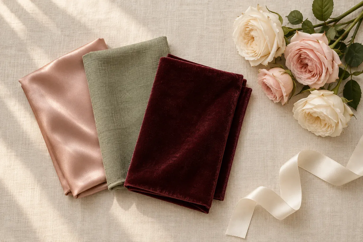
For example, an ivory-led table might use a broad pale linen field, a substantial sage element and smaller burgundy details. Do not translate that into exactly 60% ivory flowers or 10% burgundy garments. Look at the whole arrangement and adjust until the intended color leads. Different event areas can use different proportions while staying within the same direction.
Wedding color palette ideas by season and style
These are original example palettes with our own hex values, not vendor specifications or official seasonal colors. The season names are creative prompts. Use the codes for a digital reference, then confirm real materials and the acceptable color range with the people supplying them. No listed palette assumes particular flowers will be available.
- Spring garden
- Ivory #F7F1E8, blush #E6BBC2, pale lilac #D5C5E7 and sage #A7B59C. Let ivory form the base, blush lead, and lilac or sage support selected details rather than making four equal bands of color.
- Summer courtyard
- Warm white #F7F4E9, apricot #E6AE84, muted coral #CA796B and olive #788365. Use apricot and coral in related roles, with green or existing foliage providing contrast. Compare the set with the venue’s surfaces before choosing it.
- Autumn material study
- Cream #EFE4D2, terracotta #AD654D, ochre #AC883F and deep brown #503C32. Keep cream as a broad field, clay as the lead and ochre in smaller details; use the dark brown when the composition needs an anchor.
- Winter evening
- Soft ivory #F3EDE5, burgundy #733C4C, dusty rose #C4999F and charcoal #34343A. Try burgundy as the main event color with rose supporting it, rather than placing every dark member across large areas.
- Neutral modern
- White #F5F3EE, stone #CBC5BB, taupe #97877A and slate #59666E. Make the different values and materials visible so the palette remains intentional without requiring a bright accent.
If you like the lighter examples, explore pastel colors. For clay, wood and ochre combinations, see earth tones. The neutral colors guide helps compare creams, grays and taupes when your base matters more than the accent.
Test wedding color schemes with fabric and flower references
Build a small material test rather than approving digital squares alone. Put a fabric sample, paper sample and relevant flower references beside a venue image. Include a darker item if it will appear, such as attire or furniture. Ask whether the lead hue remains clear, whether the neutral fits and whether the proposed accent is doing useful work.
Photographs are useful for discussion, but they should not be treated as exact color specifications for fabric, flowers or print. Keep the physical fabric and paper samples when you can. For flowers, give your florist the desired color range and overall relationship, then discuss workable options and substitutions. A natural variation that stays within the direction can be more useful than a promise of pixel-perfect matching.
- Compare the whole material group, not only individual samples viewed separately.
- State whether a reference contributes color, texture, arrangement shape or several qualities.
- Separate the digital palette direction from approved physical materials.
- Mark uncertain or proposed items so they cannot be mistaken for confirmed selections.
- Request a vendor’s interpretation and check it before authorizing an order or change.
If you want to derive a starting set from your own venue or fabric photographs, use the color palette from image guide. Select useful colors and give them roles afterward. An extracted swatch row can include shadows, highlights or background objects; it does not decide which colors should lead your wedding design.
Know when your wedding palette is ready
Stop collecting when the remaining questions are practical rather than aesthetic: which sample will be supplied, whether a proposed substitution works, or where the accent should appear. A useful palette is not the one with the most inspiration photos. It is the one that supports decisions with a clear hierarchy and enough context to interpret it.
- The palette fits the venue and the important fixed details, or any deliberate contrast is explained.
- Each selected color has a role and the overall proportions have been tested in a simple composition.
- Physical samples and vendor feasibility questions are confirmed or clearly marked as open.
- The shared board shows the current direction, credited references and acceptable variations.
- Your partner and the relevant vendors can tell what is agreed and what still needs an answer.
A wedding does not need a tightly matched color scheme to be coherent. You can keep a broad material direction and let individual details vary. Decide how much coordination you want, then make that intention legible; do not create strict matching requirements merely because an example palette happens to contain four precise codes.
Questions and answers
How do I choose my wedding colors?
Start with your shared preferences, venue, season and fixed details. Pick a lead hue or neutral, add supporting colors with specific jobs, and test them beside fabric, paper and flower references. Confirm feasibility with your vendors before treating the palette as finalized.
How many colors should be in a wedding palette?
Three to five is a manageable starting point, not a rule. A neutral and one lead color may be enough. Add another color only when it supplies a distinct supporting role or accent, and include visible venue materials in the overall comparison.
Do wedding colors have to match the season?
No. Season can inspire the palette, but it does not require spring pastels or autumn rust. Prioritize your preferences and venue, then ask your vendors about the materials and flowers feasible for your date and location.
What is the 60–30–10 rule for wedding colors?
It is a common design guideline for roughly 60% dominant color, 30% secondary color and 10% accent. Use it to think about visual weight, not as a requirement to count wedding items or match exact percentages across the whole event.
Should bridesmaid dresses and flowers match exactly?
They do not have to. Compare the actual fabric with flower references and decide whether you want a close match, related shades or deliberate contrast. Communicate an acceptable color range to the florist instead of treating a screen hex code as a guarantee.
How do I share a wedding color palette with vendors?
Share a concise board with the current palette, material references, color roles, decision status and the questions relevant to each vendor. Use intentional access controls, omit private information and distinguish inspiration from approved purchases or changes.